
before

after

Interview with Eirik Haddal, a Brand Manager of Bue Salmon
Can you introduce us to the brand, and how the past brands were conceptualized?
The project started in 2015, leading the way in producing salmon on land, which is a relatively new industry. Although we began years ago, production only started in 2022. We were one of the first to apply for permits to farm salmon on land.
The founders founded the company as “Bulandet Miljöfisk”, and Miljö translates to environment and fisk as a fish. So the original name Miljöfisk aptly describes the mission of creating a more sustainable and environmentally friendly way of producing salmon.
Bue Salmon old logo
Although the name worked well in the early stage of development and construction, it had too much of an industrial name - a Norwegian flair- for the long term.

Bue Salmon new logo
How did the rebranding of Bue Salmon conversation begin?
So, the need of rebranding became clear due to the existing brand identity, including the name and logo, did not fully align with the new phase and broader ambitions of the company.
The conversation began with the question of when would be the ideal time to rebrand the company, creating a more wholesome and aligned visual identity that reflects its values, while also establishing a timeless brand that can withstand future changes.
It was essentially a shift from focusing on construction to active aquaculture operations, emphasizing external relationships with customers and partners.
This rebranding is necessary to become more extroverted and align our focus areas with our long-term strategic goal of being a leading aquaculture company.
To achieve more effective communication, it was crucial to retain the essence of Bulandet, the island where the pilot facility is located, as it represents the cultural heritage of the place and its people. We wanted to honor that legacy while also creating a fresh start for all the new people who came on board.
Where is the inspiration of the logo coming from, and what does it symbolize for the company?
The inspiration for the Bue Salmon logo comes from our deep cultural heritage at Bulandet, which has centuries of fishing traditions. KIND, the creative agency, played a pivotal role in translating our brand vision into something timeless, simple, and recognizable.
We wanted the logo to encapsulate our vision, values, and aspirations in a visually compelling way, representing our heritage, commitment to sustainability, and ambition for international growth and innovation.
Source: Bue Salmon
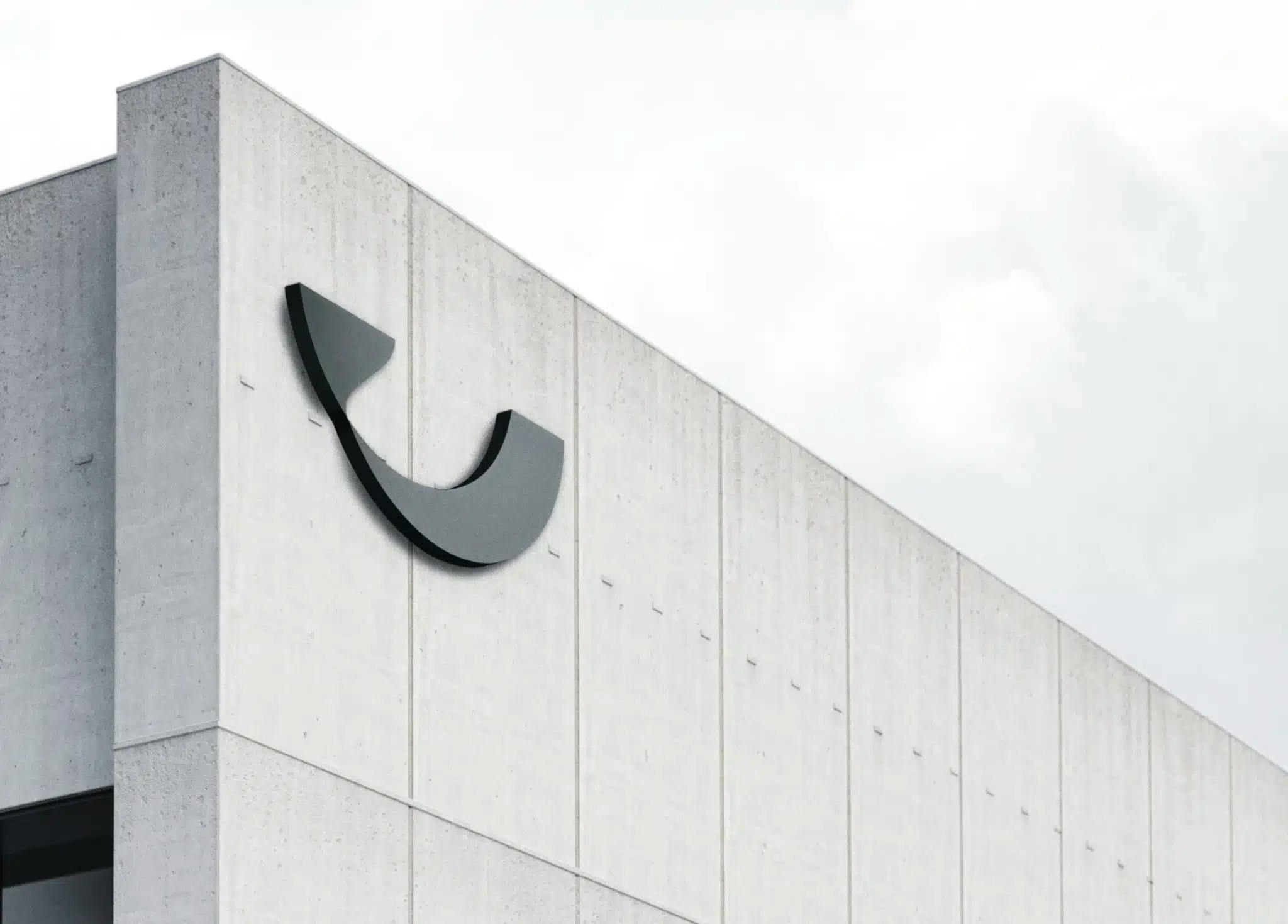
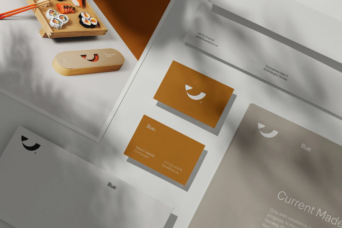
The logo's U shape symbolizes a fish, highlighting our core business and linking to the fishing traditions. We aimed for simplicity, as luxury and premium products often share this quality—small, simple, and elegant.
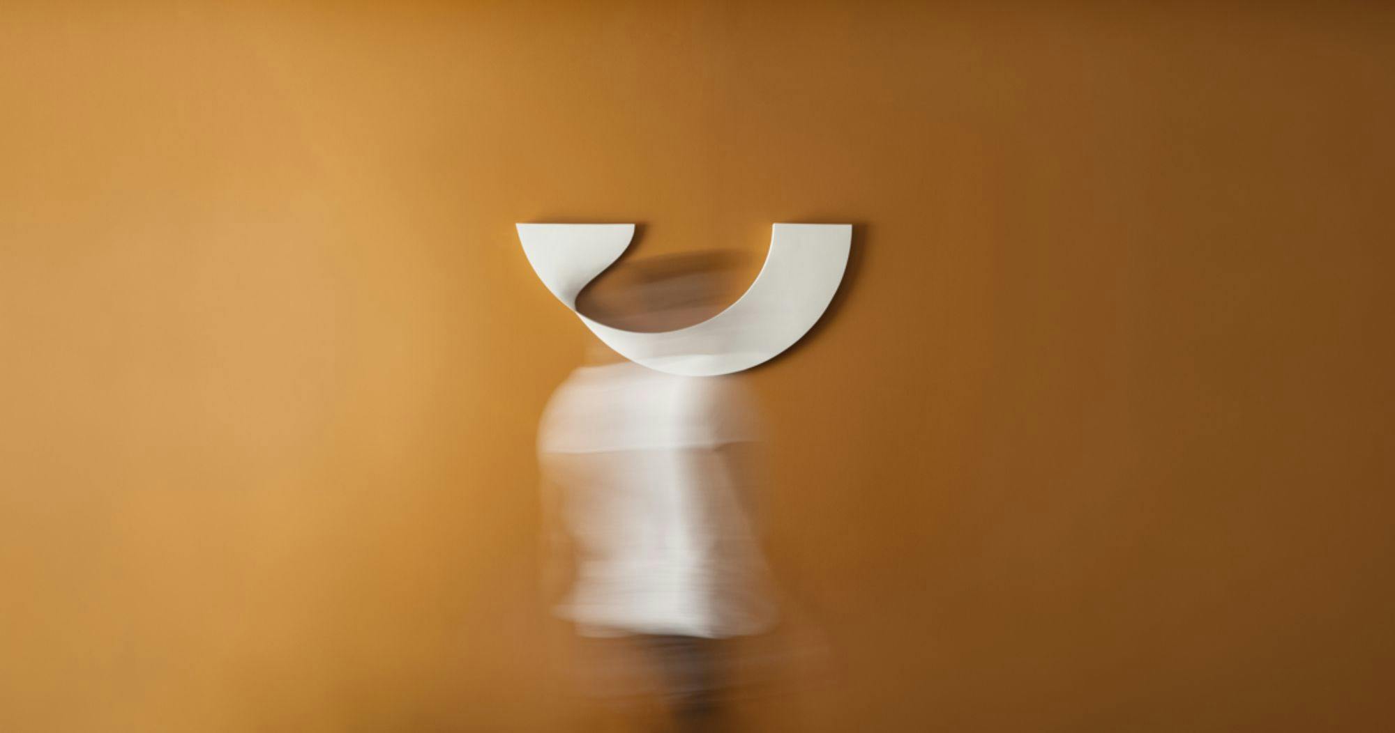
The clean lines of the logo project our forward-looking vision, while also signifying the positivity and wellbeing of our fish.
The name "Bue" is the short form to the original name of the island, Bulandet, and also means "bow," symbolizing a bridge - the island community is connected by bridges.
This connection to our past and our drive for interconnected collaboration with nature is central to our brand identity, ultimately reflecting where we come from. For centuries, Norwegian islanders have worked with, against, and within the elements, building a strong tradition in fishery and aquaculture.

Source: Bue Salmon
This industry has nourished our population, driven economic value, and woven our coastal activities into the global market. That’s what Bue is about: learning from the past while always looking toward the future.
How did the natural landscape inspire the choice of ‘Ochre’ as your brand color, and what does it represent?
Being able to highlight our unique identity and heritage was important to us. At the same time we want to differentiate ourselves from other aquaculture companies.
Many of these companies, both large and small, Norwegian and foreign, tend to use similar colors like green, blue, and black, symbolizing elements of the sea or sustainability. While we share these values, we wanted to express them differently.
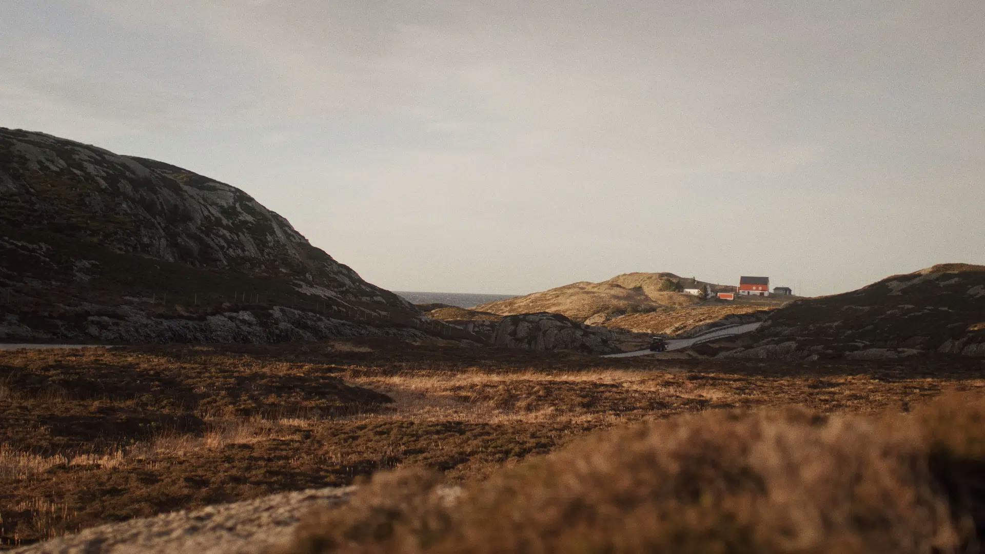
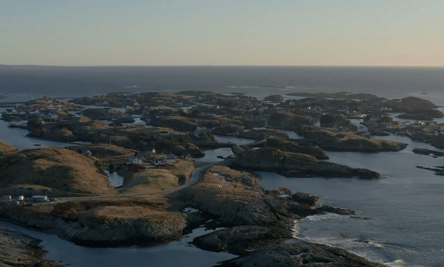
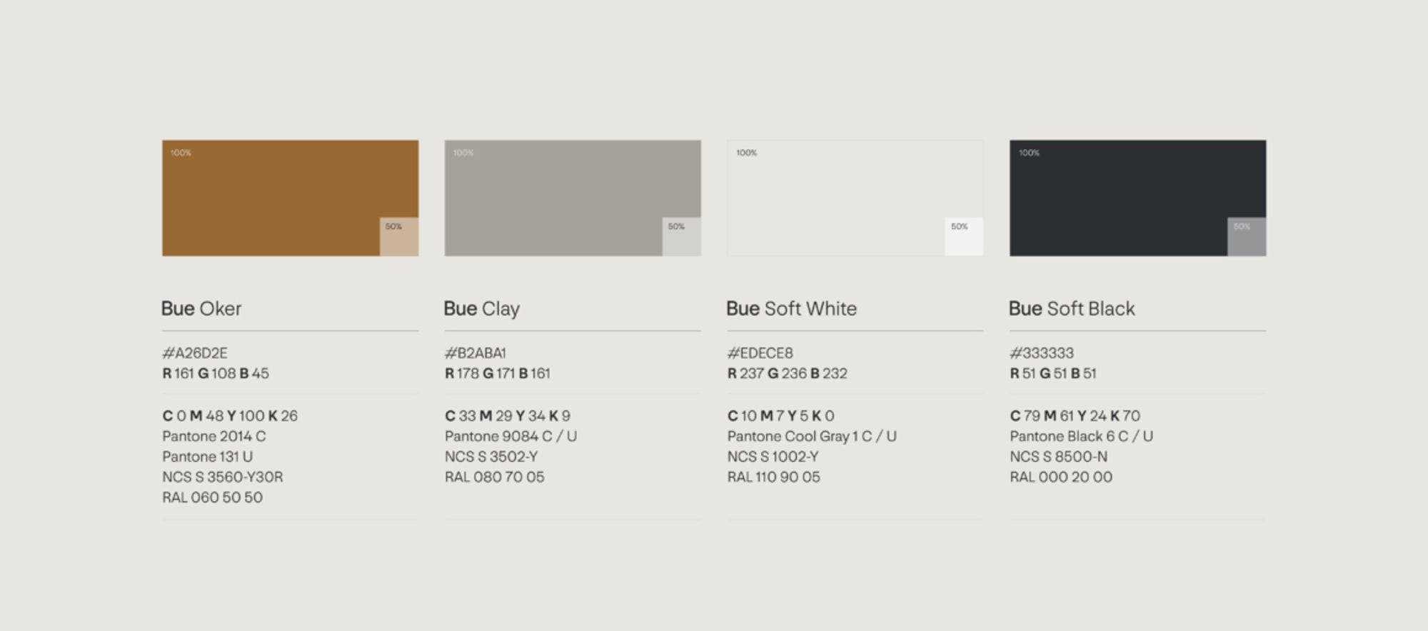
The choice of "Ochre" for our brand color, along with the entire color palette, reflects the natural environment of our island.
In early September, when the fall starts to show, the vegetation on the island turns to ochre, with yellowish hues reflecting off the rocks, waves, and sand. These colors were carefully selected to represent our earthy, land-based approach, emphasizing our deep connection to the land and our surroundings.
Since our operations are onshore, we wanted the color palette to convey warmth and a sense of belonging to the natural environment around us.
Additionally, "Ochre" serves as a cultural homage to the old fishing huts along the Norwegian coast, where fishermen keep their boats and equipment year round.
This color is deeply associated with the coast, from south to north, making it a natural fit for our brand identity.
How did you collaborate with KIND during the rebranding process, and what was their role in shaping the new identity of Bue?
We chose to collaborate with KIND because of their proximity to our base in Bergen and the trust we had in their expertise. So, when you want to work closely together and shape something new, you have the trust in the people and the expertise.
KIND really knows how to simplify and strengthen the key messages and make them visually compelling. They led the brand vision process, understanding our aspirations and values, even when we couldn’t articulate them properly at the start.
They managed to extract what we said and use it to create guidelines for all other creative work, from colors to fonts and grid to everything. One thing I want to highlight about KIND is that they are really good at telling those stories along the way, and that’s also the tool to be able to convey to others the decisions related to the brand.
We were also very close in the process, which I think has its pros and cons. It’s nice knowing that being part of it and being close to it makes sure that everything resonates with your beliefs.
Sometimes we’re working a little bit too close to their creative process and the way that they are working, so I still haven’t found a perfect balance of being close to it and giving them space to create freely.

We spent about a year from the start til the finish. It was a lot of back and forth, and in the end, we came up with something cohesive and beautiful.
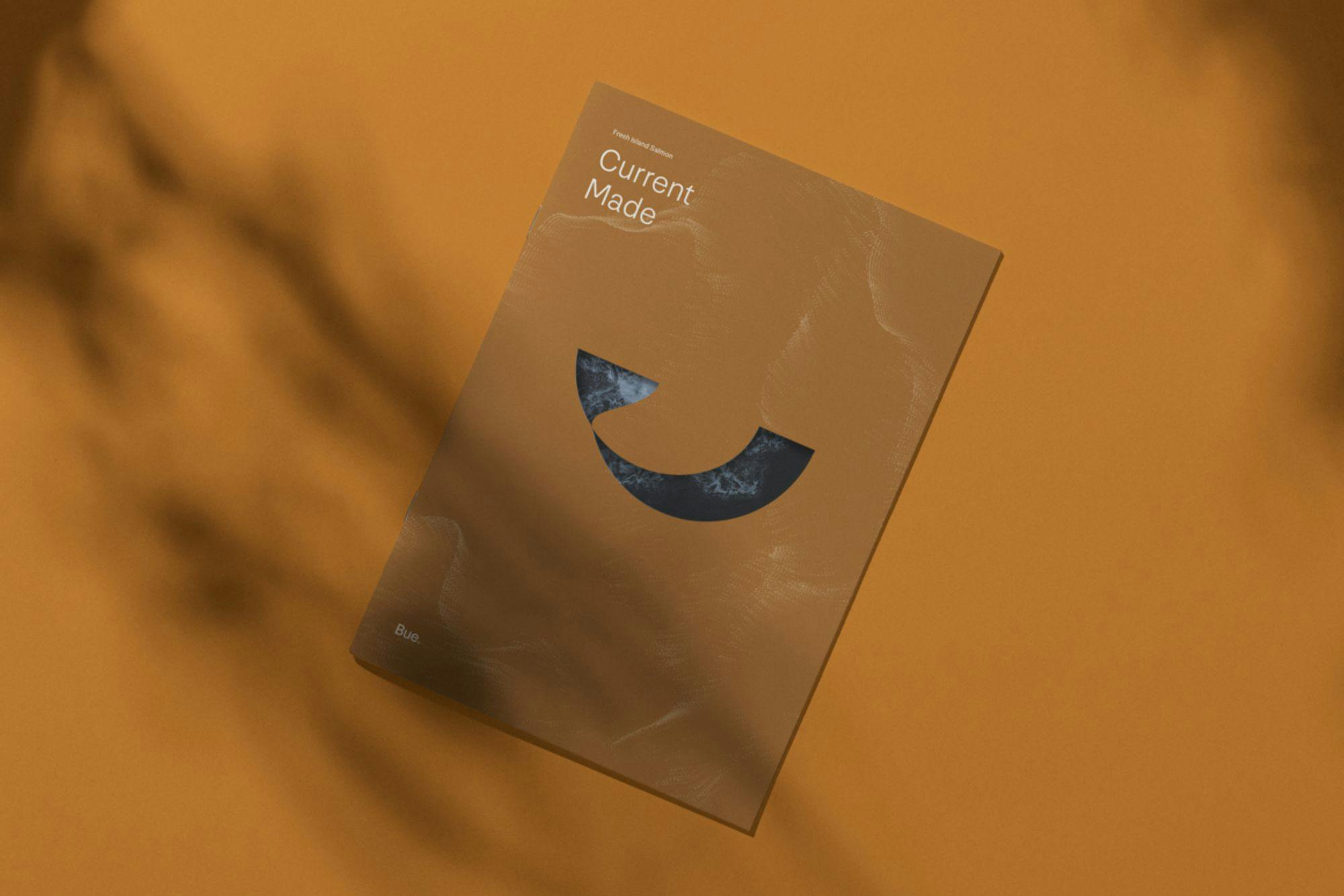
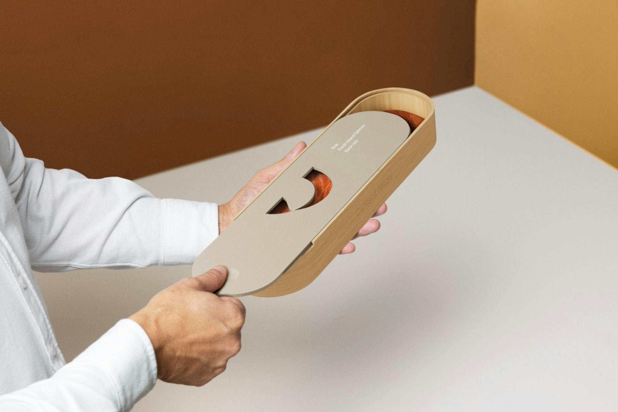
What are the key features of the premium loins packaging for the Bue Salmon, and how is it designed for sustainability?
The packaging design for the premium loins is currently conceptual, showcasing how it might look in the future. While we are focused on business-to-business right now, the design reflects our brand’s premium quality, uniqueness, and heritage.
It illustrates future possibilities rather than immediate implementation.
Source: Bue Salmon
As someone in the brand department, I find the design visually appealing and look forward to it when the time is right. However, our current focus is scalability of the production and supply chain and business to customers if a future consideration.
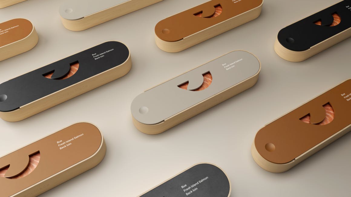
We haven’t invested much effort into the specifics of materials and recycling yet. Still, sustainability will become a crucial aspect of the packaging design when it becomes a focus area.
What is your major takeaway from this experience? Do you have any advice, personal anecdotes about challenges, or interesting trivia for brands or designers considering rebranding?
In terms of takeaway, working with the top-notch creatives and professionals comes with a premium, and it’s very inspiring and meaningful. I’ve learned a lot working with the agency, and it’s been nothing short of inspiring.
The way they translated our vision into a visual form has strengthened our collective. One of the most meaningful parts of the rebranding process was the internal launch. Unveiling the new logo sign at the facility was a powerful moment, seeing the proud faces of our team under the new logo.
It fostered an instant sense of “we,” a fresh start that made everyone feel like entrepreneurs, all contributing to building our future.
Source: Bue Salmon
As a Branding Manager, I spend so much time working in isolation, so seeing that moment of pride and unity was a beautiful thing. It’s become an important tool for moving forward, with a sense of ownership over both the look and feel, as well as the storytelling elements of our brand.
Regarding challenges, it’s essential to recognize that the best work often comes with a premium, and that extra magic is worth it.

However, timing is crucial. Investing heavily before delivering on your brand’s promise might not be ideal, but when you can, that little extra magic makes you stand out.
Finally, it’s vital to remember that we, the people, are the brand. The shiny objects are just extras. Understanding that branding starts with our behavior and actions is key. For startups, knowing when to invest and when to settle for “good enough” is critical because every penny counts, and you can only use it once.