
before
after

Interview with Robyn Kassam, Head of Brand at Checkmyfile.
Can you introduce yourself and share your journey to joining Checkmyfile?
I’ve been with Checkmyfile for just over a year now. Before that, I spent 15 years working with branding agencies, which gave me a strong background in branding. I wanted to move client-side to have more impact and be directly involved in driving projects forward, especially during a brand relaunch.
When Checkmyfile started working with the branding agency I was at, I led the account and got to know the company well through research, interviews, and insights. I was impressed by their approach, their focus on helping people understand their financial position, and their stability as a business.
The transition felt very natural because of the great working relationship we’d built. My previous agency was supportive when I made the move, and I’ve really enjoyed bringing my experience to Checkmyfile and contributing on a deeper level.
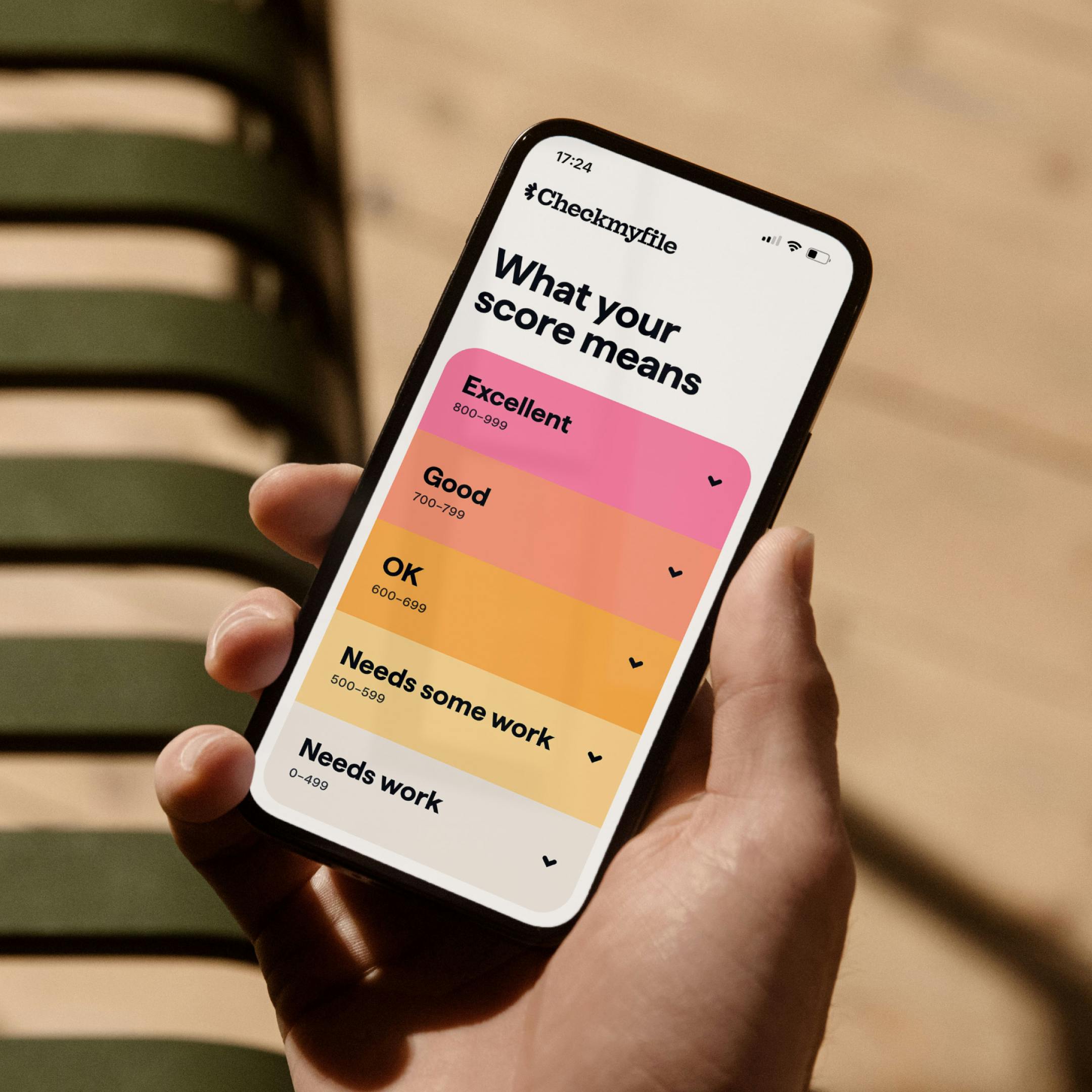
Image Courtesy by Checkmyfile
Can you share the history of Checkmyfile and what led to the decision to rebrand?
Checkmyfile has been around for nearly 25 years and is well-established in the credit reporting world, serving just under a million customers a year. However, it lacked the brand awareness to match its success.
The company wanted to grow its brand awareness, become synonymous with credit reports, and stand out more confidently. The previous branding was very generic, blending into the "sea of sameness" typical in the finance industry—everyone uses blue, looks the same, and follows the same patterns.

Image Courtesy by Checkmyfile
To break away from this, the team went through a pitch process to find an agency that could help them take a bold and impactful approach. Ragged Edge stood out because of their focus on going against industry norms and creating a brand that looked and sounded different, rather than just following the same old rules.
The new logo is striking. Can you share the inspiration behind the design and how it reflects the message Checkmyfile wants to convey?
There are a few elements behind the new logo and branding. In the credit industry, customers often feel trapped and unsure of where to turn. There’s also a big myth we’re trying to debunk—that checking your credit score has a negative impact. It doesn’t. We want to help people understand their credit health position without shame or confusion and guide them on their journey.

Image Courtesy by Checkmyfile
We wanted to move away from the industry standard of using a dial and instead create something more motivational, with colours that feel progressive and inviting. We also built the concept of “credit steps” into the design, helping people see where they stand and what they can do next.
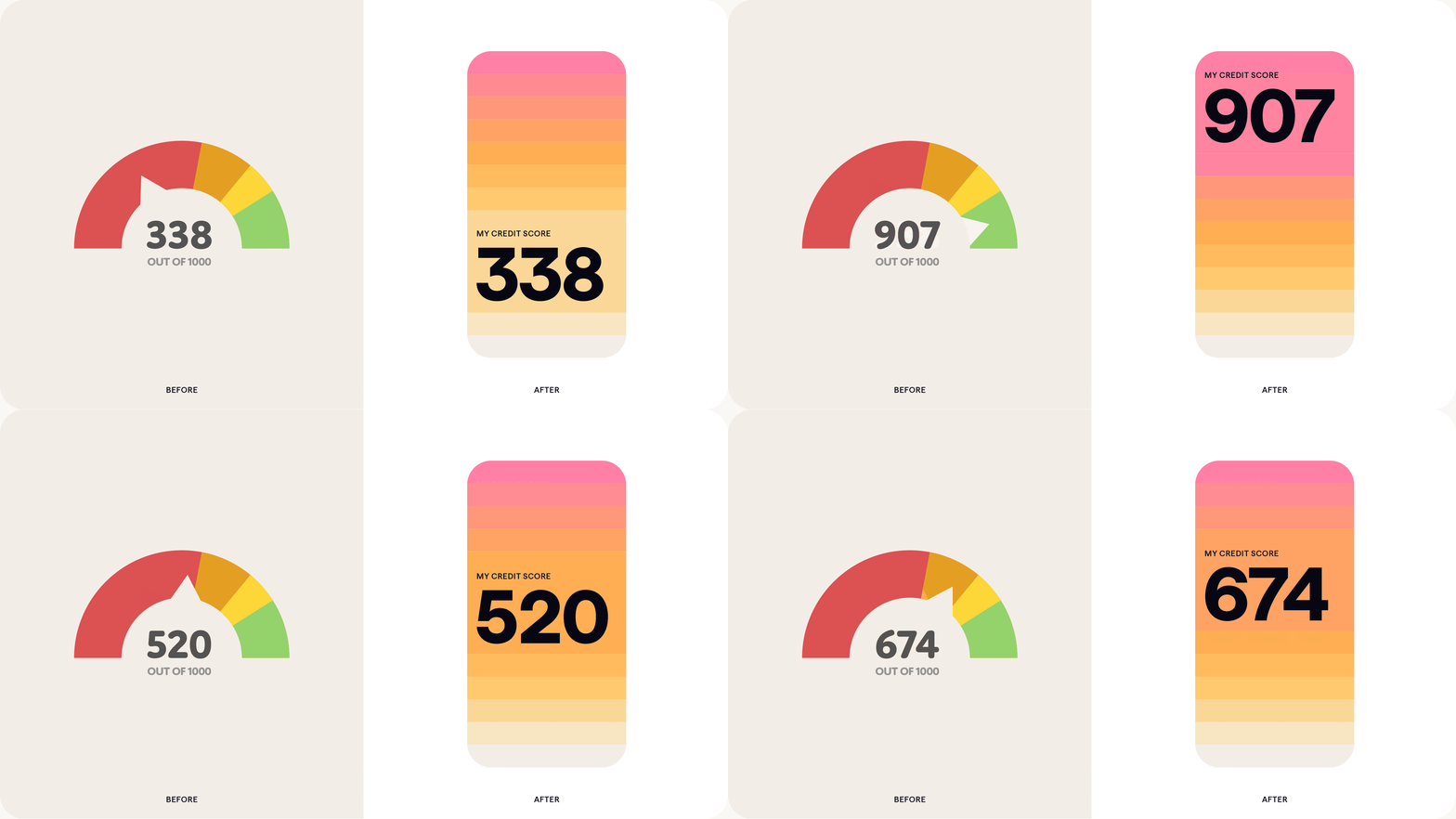
Image Courtesy by Checkmyfile
The new logo itself is striking, with soft edges to make it feel warm and uplifting. There’s a subtle “C” within it to connect back to Checkmyfile, and while some see sun rays, that wasn’t intentional—it’s just a design that works. When in motion, the logo draws people in and portrays progress and development.

Image Courtesy by Checkmyfile
We were also conscious of moving away from the more masculine feel of the previous branding. While pink is part of the spectrum, we’ve used it in a way that feels strong and authoritative, rather than overly feminine or cliché.
Beyond the logo, we’ve leaned heavily on illustrations that feel progress-focused, with about 30 different designs in the new suite. These illustrations use the color palette and tell a story, helping people feel in control of their journey rather than at the mercy of the system. The aim is to provide tools and guidance that empower people to take the steps they need.

Image Courtesy by Checkmyfile
We’ve also moved away from stock photography or anything that feels fake or staged. Instead, we focus on authentic imagery and the “whites of people’s eyes” to make the visuals feel real and human. Altogether, the new branding is about making customers feel supported, informed, and in control.
What unique visual elements in this rebrand do you feel best represent Checkmyfile’s identity?
The illustrations are a standout feature. We’ve integrated the spectrum and credit steps into the illustration style to represent the journey we want to guide customers through. As someone with years of branding experience, I think it’s important for people to recognize your visuals without needing to see your logo—that sense of visual identity is key.

Image Courtesy by Checkmyfile
One example is the illustration on our homepage, which resembles a sunset with steps leading upward. We see it as our hero illustration because it reflects our message: the steps you take today can lead to a positive future. It’s something we’re working to build a lot of equity into, making it a strong symbol of what Checkmyfile stands for.
How did you select Lan Truong as the illustrator for Checkmyfile’s rebrand, and what was the process of creating her illustrations?
We explored around five or six different illustrative styles to find the right fit for the vision we wanted to create. Some illustrators were incredibly talented but prohibitively expensive, so we couldn’t move forward with them. Lan Truong stood out because her style felt warm, approachable, and distinct—nobody else in the industry was working with anything similar.
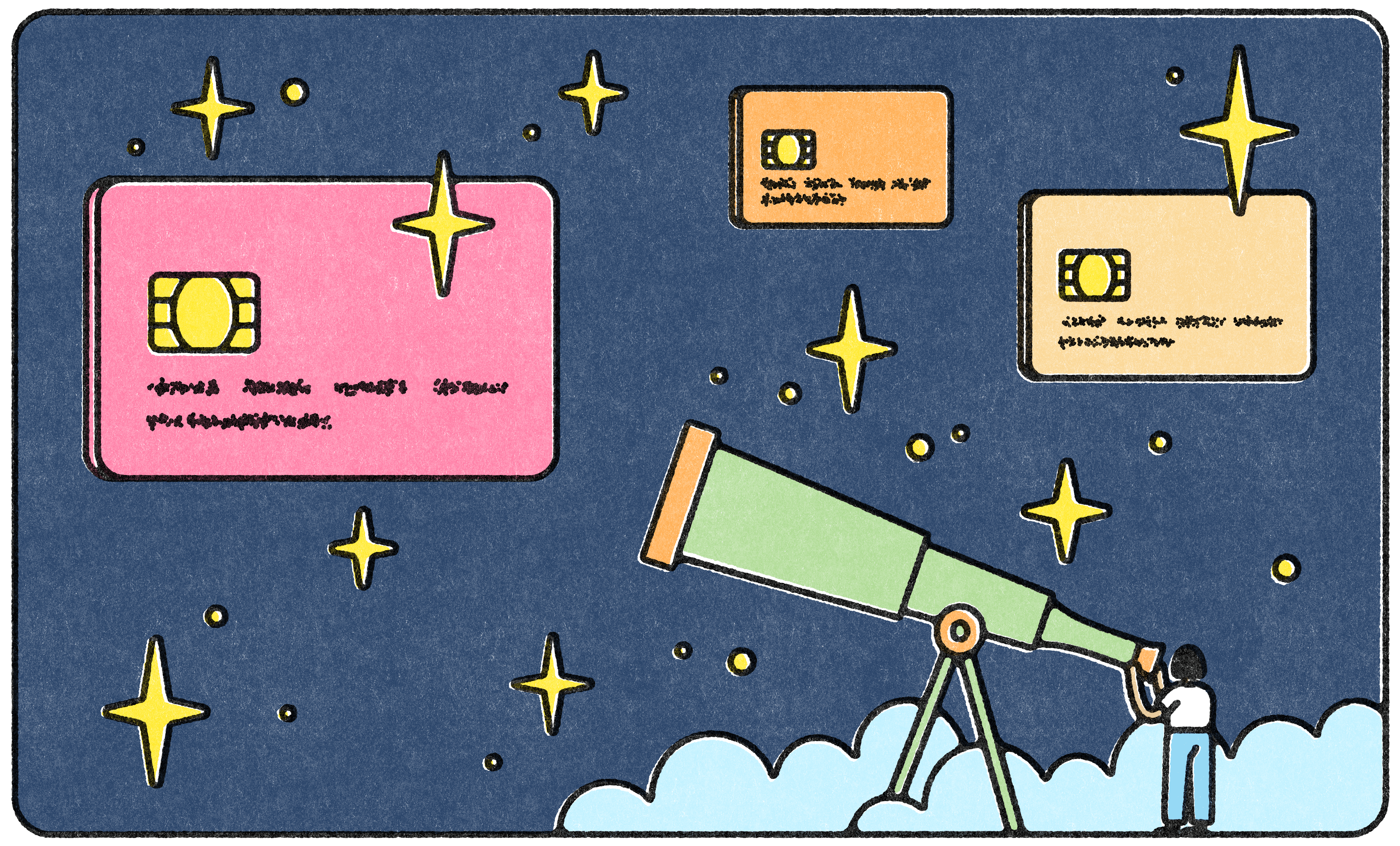
Image Courtesy by Checkmyfile
Lan was commissioned and managed by Ragged Edge to create 30 illustrations.We worked closely together to identify the specific illustrations needed, provided briefs, and refined the final pieces through back-and-forth communication.

Image Courtesy by Checkmyfile
What led Checkmyfile to partner with Ragged Edge? What made them the right choice?
Checkmyfile considered five or six branding agencies in the UK before choosing Ragged Edge. One key reason was their focus on working with “change makers”—companies aiming to have a positive impact on the world. While not necessarily charities or NGOs, these are businesses that influence change and give people tools to improve their lives. This mission aligned closely with what Checkmyfile wanted to achieve.
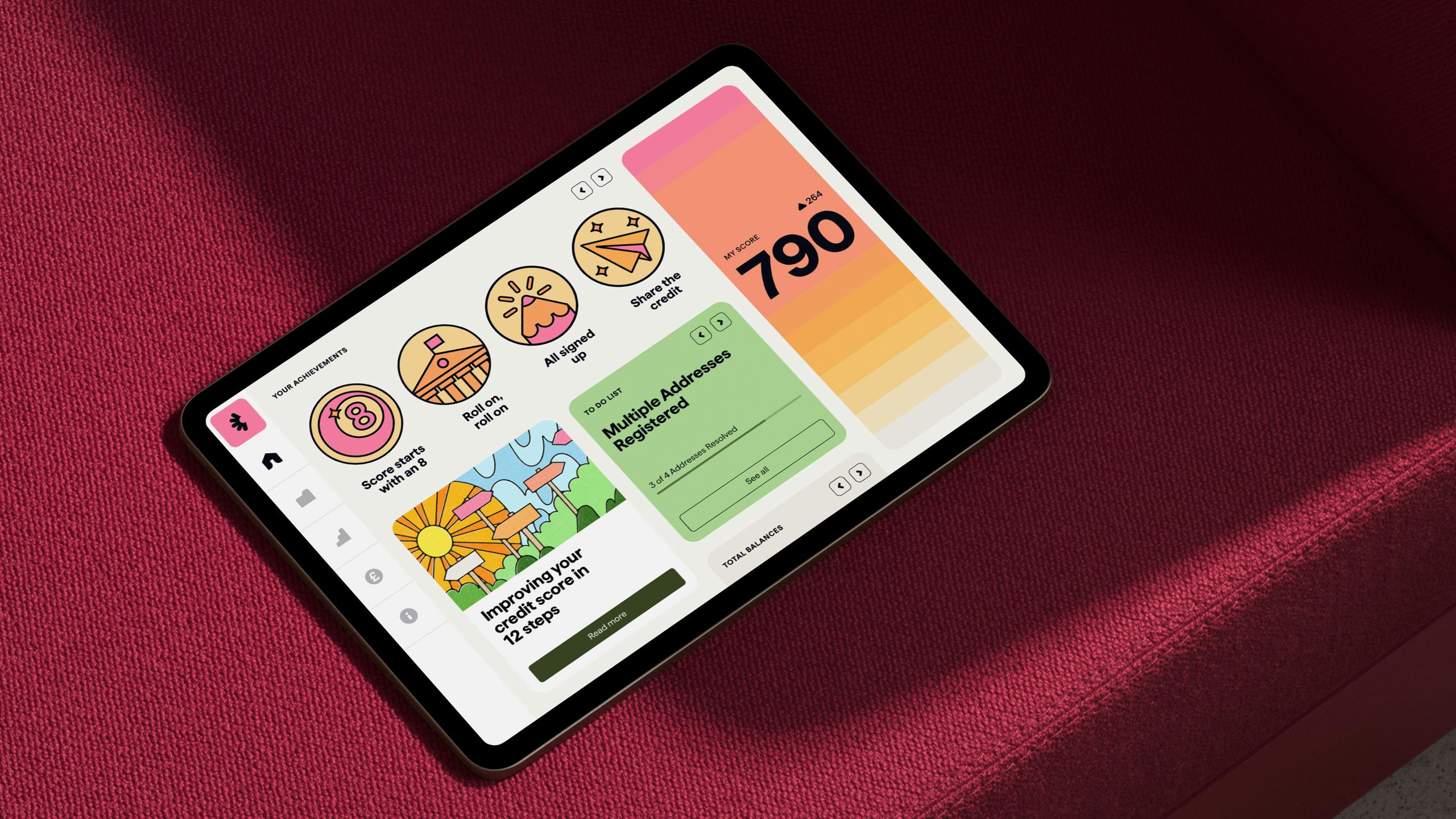
Image Courtesy by Checkmyfile
Ragged Edge’s approach emphasised bravery and taking bold steps to stand out, which was exactly what a 25-year-old company like Checkmyfile needed. Their team didn’t just settle for safe, rational decisions but pushed for creative and emotive solutions to make the brand truly different from competitors.
What set Ragged Edge apart was their strategic depth. Many agencies can provide a functional design system, but Ragged Edge went further by aligning the brand strategy with every part of the business—from customer service tone of voice to recruitment and talent retention. They helped Checkmyfile create a brand that doesn’t just look good but also impacts how the company operates and interacts with customers.

This comprehensive approach ensured the rebrand wasn’t just about having “pink in the logo” but about making meaningful changes across the business that drive real impact.
What challenges did Checkmyfile face during the rebranding process, and how were they addressed?
There were definitely challenges, but many of them were identified early on in the project. The rebranding wasn’t just about updating colors, logos, and fonts—it involved a complete re-platforming of the website. The team implemented a new cloud-based system and updated various technologies to ensure everything worked seamlessly together. This was a significant resource challenge, which is why the entire process took 18 months.

Image Courtesy by Checkmyfile
The branding phase with Ragged Edge lasted about nine months, but additional time was needed to build and update the product while keeping Ragged Edge involved. Throughout the process, we worked collaboratively with them, seeking their advice on different aspects, from re-platforming decisions to customer communication strategies.
Instead of major roadblocks, the challenges were more about managing the scope and aligning all aspects of the business with the new brand. For example, creating new email templates, refining the product layout, and ensuring the customer service team could speak in the updated tone of voice were all part of the process. Ragged Edge’s input was invaluable in keeping everything connected and consistent with the new brand identity.
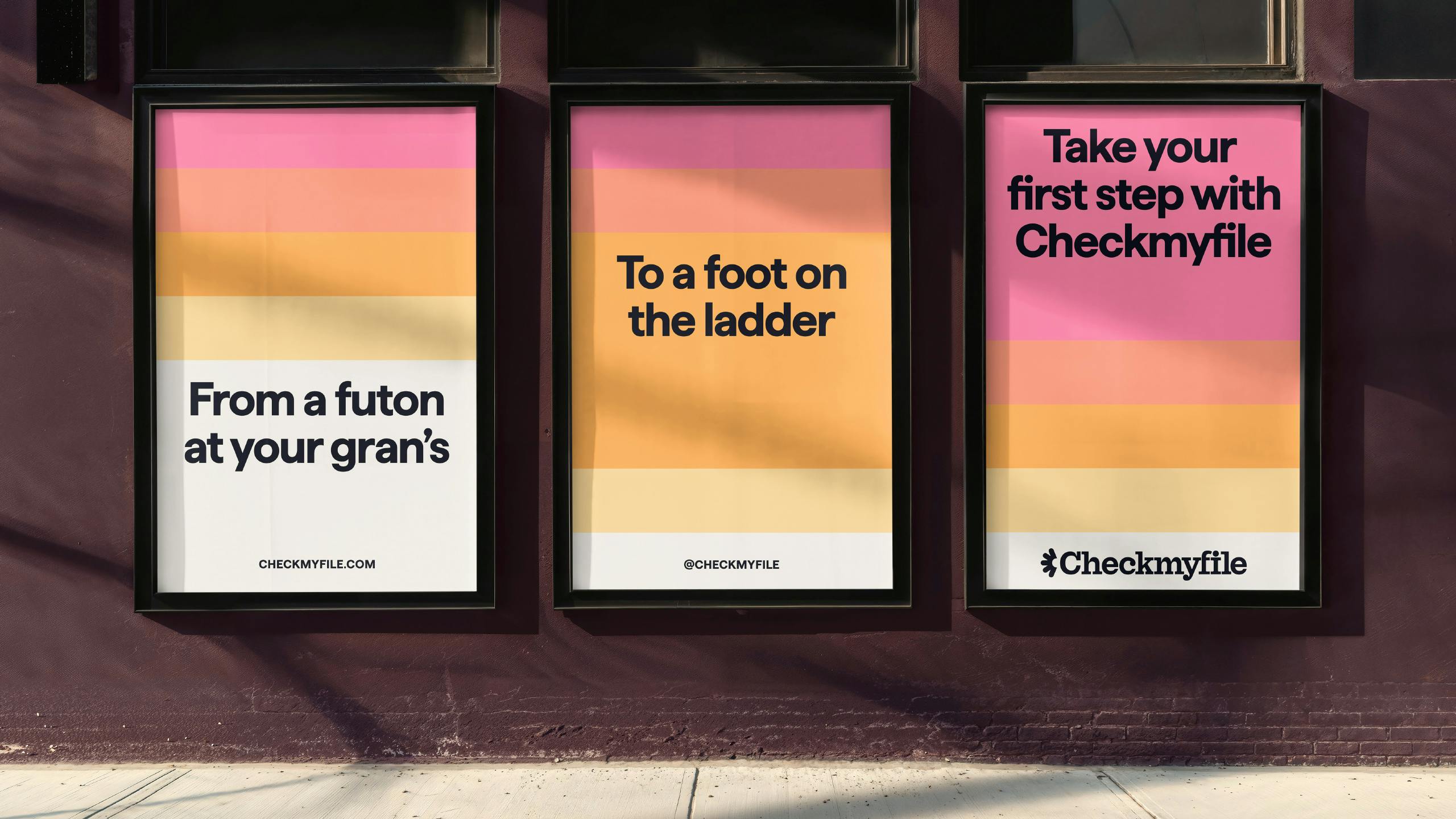
Image Courtesy by Checkmyfile
How does Checkmyfile’s new identity and approach set it apart in the competitive credit reporting industry?
Visually, the new identity stands out because it looks nothing like competitors. It has a unique style that would be hard to replicate without it feeling obvious, which sets us apart.
Functionally, we differentiate ourselves by integrating data from three credit reference agencies, offering more detailed insights than most competitors. Our focus is on supporting customers by helping them understand their credit health, make informed decisions, and progress toward their goals.

Image Courtesy by Checkmyfile
We aim to educate customers about the broader impact of their credit reports, such as how bad markers can unfairly affect things like insurance premiums. By empowering customers with knowledge and tools, we strive to help them navigate these challenges and unlock better opportunities in the future.
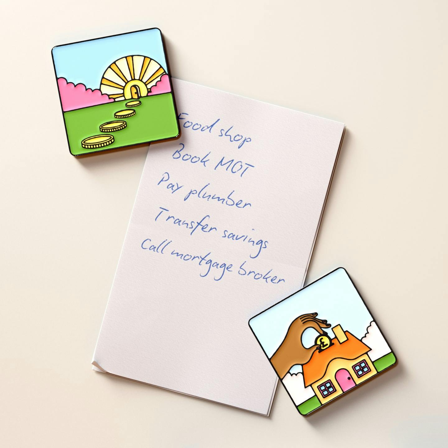
Image Courtesy by Checkmyfile
Have you noticed any positive feedback or changes from customers since the rebranding?
We’ve noticed that customers are spending more time on the site, reading articles that are now better surfaced, and educating themselves more effectively. They’re also subscribing for longer, showing they’re recognizing the value of the service and its benefits.
The rebrand has also allowed us to engage more effectively with customers through marketing activities, particularly on social media. With a stronger brand story, we can now share our message and connect with our audience in ways that weren’t possible before.

Image Courtesy by Checkmyfile
Is there a specific part of the rebrand that felt especially rewarding or significant to you?
The rebrand has opened up opportunities to explore more marketing channels, including social and paid social, giving us greater scope to try new and interesting things.
It’s also had a really positive impact internally. The rebrand has given the team clearer direction about our purpose as a business and how we’re helping people. This has been incredibly motivational—it’s not just about clocking in and out. When people feel they’re working towards something meaningful, they’re more empowered and engaged.
We ran workshops to help everyone understand the strategy, tone of voice, and brand elements, so they could go on the journey with us. It’s not just about colors or logos—it’s about making everyone feel invested in what we’re trying to achieve.
From a recruitment perspective, it’s also been easier to attract talent.
We’re not just a boring finance product; we’re someone trying to have a positive impact and influence the future of people’s livelihoods. That psychological shift is massive.
Bringing in the best people means we can generate the best ideas and push the company forward more effectively, which is hugely rewarding for me personally.