
before

after

Alys Reynders Scott is the Chief Marketing Officer at D2L.
Can you introduce us to D2L and the exciting things it is doing these days?
D2L is a global learning innovation company that’s committed to helping organizations reshape the future of education and work. At D2L, we strongly believe that every mind matters – so access to learning should be universal -- across all abilities, geographies, and ages. To achieve this, we’re championing a new era of personalized learning, offering digital tools that create new opportunities for teachers to inspire learners.
The learning market is traditionally diverse and fragmented, but our technology – informed by learning science to improve retention, engagement, and learning outcomes – works at every stage of learning. We strive to evolve online learning management beyond a ‘digitized function’ to an ‘optimized function,’ by exploring how we can blend and optimize teaching and learning across both classrooms and online environments.
Over the past 23 years, D2L’s team has grown beyond our headquarters in Ontario, to include more than 1,000 colleagues around the world. The D2L platform is currently being used by a growing community of more than 15 million users across K-12, higher education, associations, and the corporate sector.
Personalized learning is critical, and that’s why it’s fundamental to everything we do here at D2L. The individual mind is capable of so much until we are dropped into a system that relies on standardized tests built for standardized brains. In reality, we don’t all think in a standardized way, and human beings don’t thrive in a system that constrains them. So, D2L built an innovative platform to change the way the world learns and uplift billions of individual thinkers.
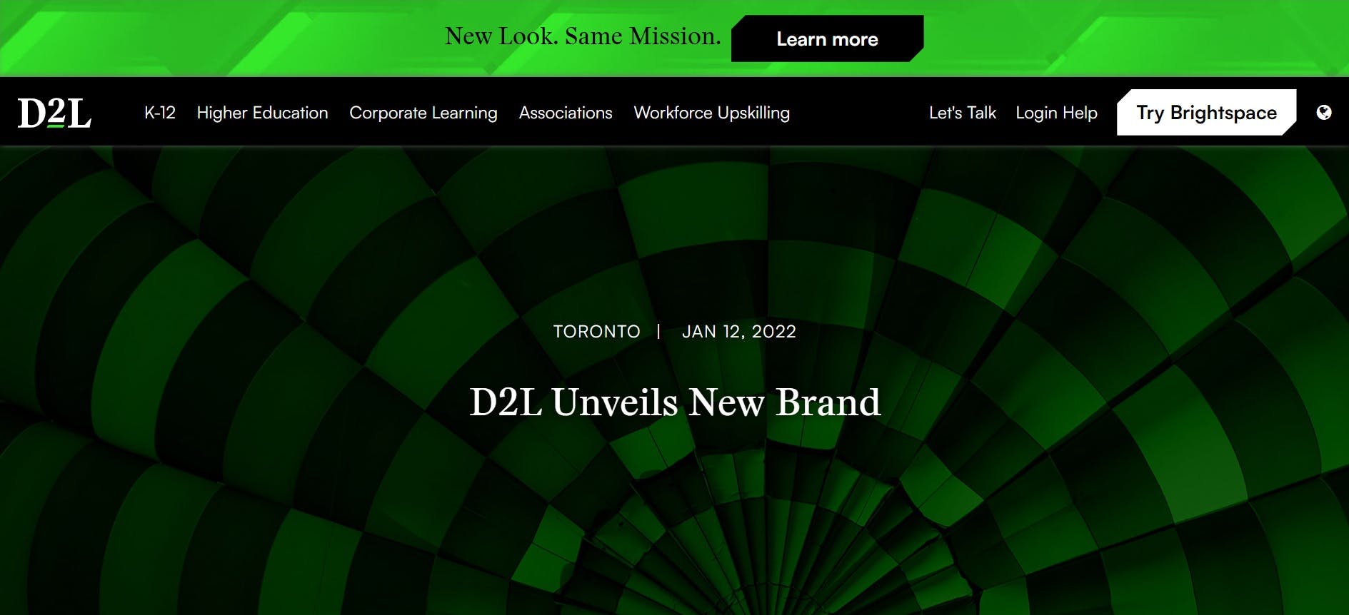
D2L Unveils New Brand
Walk us through your company’s brand identity through the years. How was the initial branding conceptualized?
John Baker founded D2L during his studies at the University of Waterloo, inspired by his own family of educators and direct experiences at university. John realized that learning is the foundation for progress. He created a learning technology that would not only impact education, but also spark a ripple effect from one person to the next, and through generations, communities, companies, and cultures.
Our previous brand hinted at John’s vision with an orange logo color, a flame, because as Gandhi put it so eloquently, "a thousand candles can be lighted from the flame of one candle, and the life of the candle will not be shortened. Happiness can be spread without diminishing that of yourself."
That said, a brand is a living breathing entity that evolves with the company. We’ve grown, we’ve evolved – and so has our brand since its original conception – but our mission is stronger than ever.
Now about this current rebranding, how did it come about? How did that conversation start?
Nobody ever changed the world by thinking the same. That’s why we’re constantly evolving as a company to reshape the future of education and work. Our rebrand is part of that.
Our company and core products have changed a lot over the last two decades, and we’ve gained experience and expertise globally. To reflect this growth, we made the decision to update our visual brand to better reflect who we are today, and who we will become, as a public company.
The COVID-19 pandemic has also been a great force for change for the education technology industry. Over the past two years, learning has been at an inflection point with unprecedented learning loss, increasing learning inequalities, spiraling costs, a need for virtual upskilling and reskilling in today’s workforce. Our brand launch embodies this change as the world enters a new personalized era of learning.
It’s a new chapter in many respects, and we needed a vibrant, innovative, unified new brand identity as a reaffirmation to improve our service delivery to our customers and partners. The result reflects our customers’ evergreen passion, power, and potential.
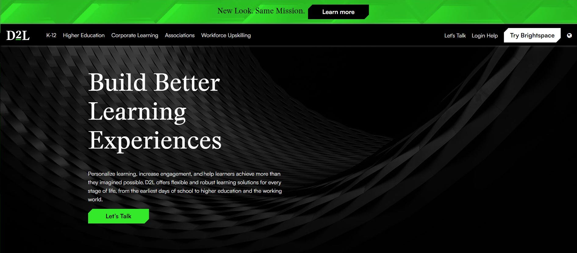
A look at how D2L's new color palette are being implemented.
We’d love to know more about the rebranding process. How did it go? Who were the key players in this project? Was it all smooth sailing? Were there surprising challenges that you encountered along the way?
We worked with Zulu Alpha Kilo, which is a Toronto-based creative company that’s led by its CCO and Founder, Zak Mroueh. Zulu has built a reputation as one of the most respected independent agencies in the world. We felt very aligned with Zulu Alpha Kilo’s culture, which is passionate, entrepreneurial, and fearless in its pursuit of groundbreaking ideas.
Together, we’ve created a new brand identity for D2L that is inspired by the people we work with and serve, and our collective commitment to helping every learner achieve more than they dreamed possible.
The process was informed by input, interviews, and ideas from across the company. I was particularly inspired by the research and conversations that helped us better examine who we are, why we’re here and who we serve.
It's always difficult to say goodbye to a logo. That said, the real joy in a brand exercise comes from the fresh look at what our brand represents – why we are here, what we are doing and who we are doing it for. Our brand renewal deepens our connection to our mission and charts a path to our future. Great brands are alive and grow.
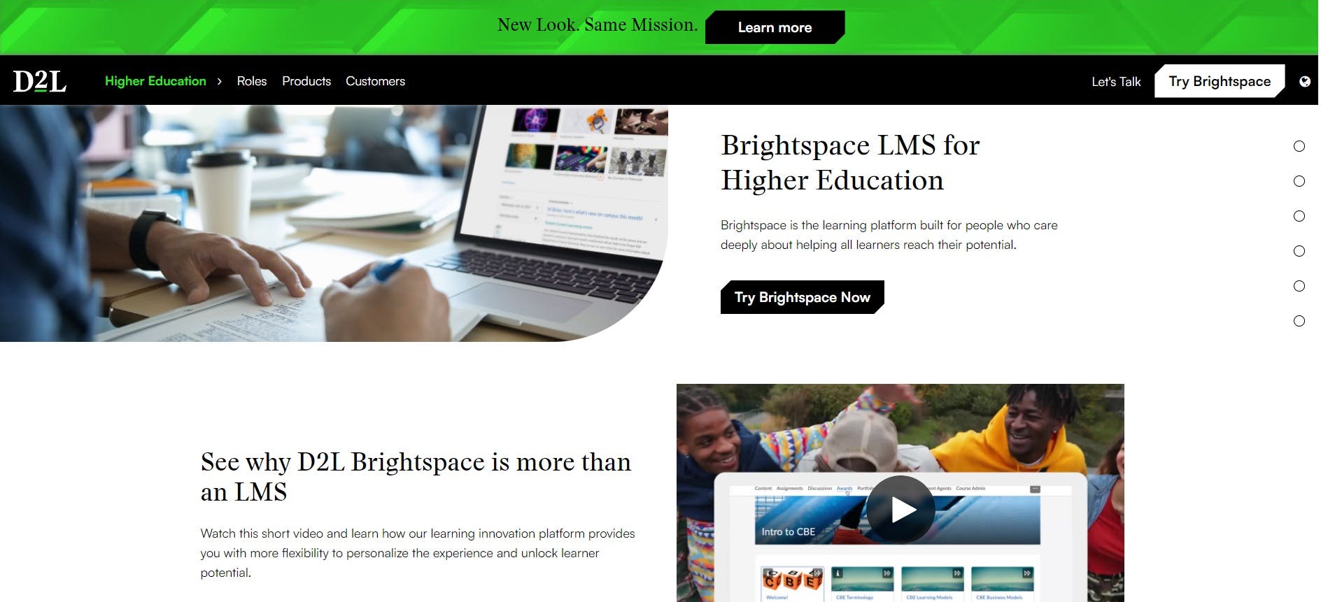
D2L's new branding on their website.
A big change was to your logo. Can you tell us more about how these were conceptualized? What’s the story behind it?
Our new logo reflects several milestone changes for D2L, and helps us better convey our vision, narrative and refreshed mission.
For us, the brand launch marked a new chapter for D2L as a public company. We took time to carefully research visual identity designs used by a selection of dominant, internationally- recognized brands. Working closely with Zulu Alpha Kilo, we chose a new, bold serif typeface and removed the ‘Desire2Learn’ text underneath to simplify and embolden the new D2L logo.
In our new logo, the ‘2’ is elevated to symbolize the concept of exponential advancement through learning. As we implement this new logo across our channels, the concept of personalization shines through its unique flexibility within our master logo. The elevated ‘2’ has the ability to shift font types to embody a personalized learning experience.
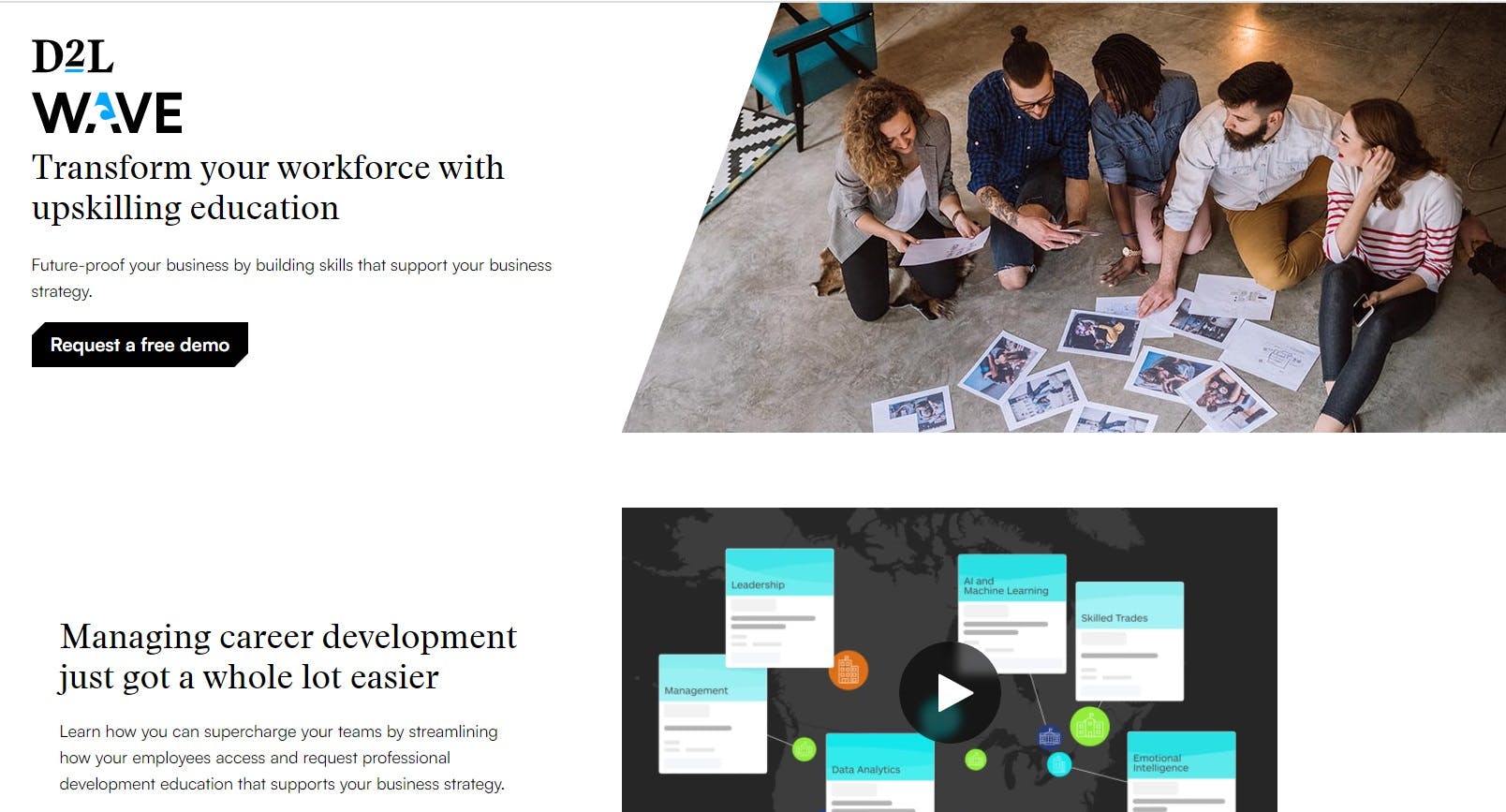
D2L Wave
Green and black are prominent colors in your new visual identity. How did you land on this color palette, and especially that particular shade of bright green? What does it say about your company?
Yes, D2L’s new logo aesthetic incorporates a green and bold, strong typeface that speaks to innovation, simplicity, and accessibility – cornerstones of our thought leadership and commitment to personalized lifelong learning. The color green is also intended to represent growth and human potential.
Various shades of green throughout the new brand design symbolize spring, youth, and rejuvenation – and the darker tones point to enduring, evergreen lifelong learning.
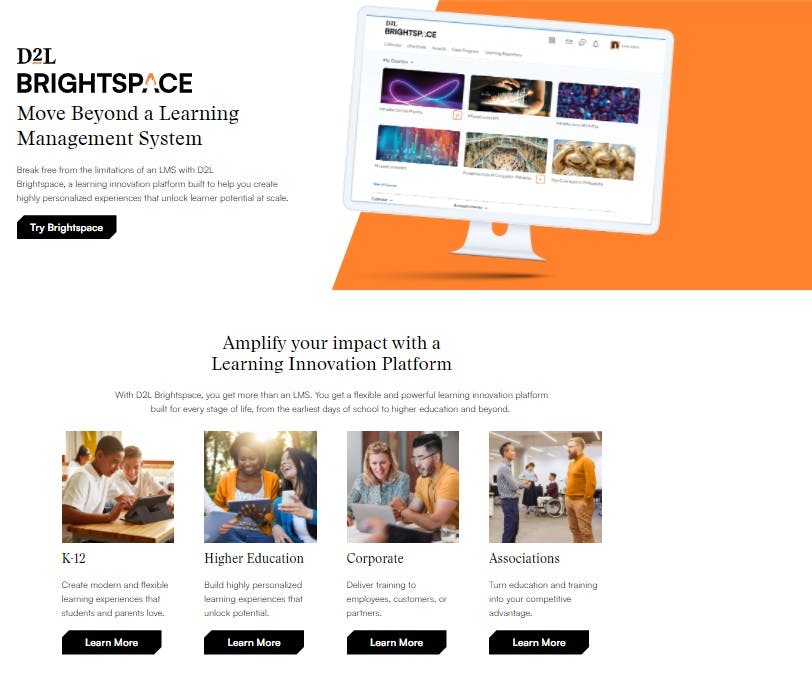
D2L Brightspace retains the familiar orange color from the previous logo.
D2L Brightspace and D2L Wave also have new logos. Can you tell us how both were conceptualized? Was it hard to also rebrand the brands under your company at the same time?
We wanted the concept of personalization to really shine through our new visual identity. This was expressed through the flexibility of our master logo, brand narratives that tell our story, and photographs and portraits that keep people front and center across our channels. However, this new brand vision is about more than just what you can see, it’s also about who we are and what we do.
We are continuously improving our products with input and insights from our customers, educators, and learners. We unified our D2L Brightspace and D2L Wave product logos under the same design system.
The new D2L Brightspace logo maintains our classic orange for a bright new look that’s fresh, yet familiar. The orange color signifies fire, with the flame in the ‘A’, which represents one flame lighting another – or the never-diminishing spread of knowledge.
The new D2L Wave logo incorporates a wave in the ‘A’ and blue, to represent education’s ripple effect. Going a step further, this represents the ways in which knowledge can grow like a wave throughout a person’s career and throughout an organization.
Aside from the logo and the colors, what significant changes have been made in your company’s visual identity?
Beyond our logo, D2L’s entire brand story is also evolving. This updated visual identity goes hand in hand with a truly refreshed brand narrative – one that emphasizes D2L’s commitment to providing educators and students with technology that ensures a personalized, flexible, and collaborative approach to education.
Learning is at an inflection point, with unprecedented transformation underway that requires more than a Learning Management System (LMS). With this launch, D2L steps into an expanded category with a Learning Innovation Platform that defines the flexible, powerful experience and breaks free from the restrictive, one-size-fits-all limitations of a traditional LMS.
Our new visual identity represents the potential and power of learning and our learning technology’s simplicity, accessibility, and clarity. The sophistication of our new logo carries throughout the visual identity system – unifying a new brand family of orange and blue product logos for D2L Brightspace and D2L Wave respectively, introducing a stylized portrait approach to photography, and supporting a modern and clean look that complements the product sets.
What should we expect from D2L in the coming years?
The demand for education technology has grown, and our goal is for D2L to become the first truly unified and comprehensive learning platform.
We aim to deliver a cohesive learning experience across markets and technologies that can evolve with customers from digitization through transformation, from novice to power user. To support this, we are well-positioned with a stake in all major learning markets; a network of academic, corporate and technology partners; and our flexible, personalized, accessible, and innovative platform.
The gains D2L made during the pandemic may well level off as the world opens up. How will D2L create a sustainable, competitive business model in an increasingly competitive EdTech landscape?
While COVID-19 has acted as a catalyst for our growth, we believe it accelerated the sustained adoption of online and blended learning experiences that we were already seeing underway.
Education is vastly under digitized, with only about four percent of global education spending on technology. D2L has a massive addressable market driven by tailwinds, including digitization, upskilling, and learning loss.
Our business remains competitive – and today, D2L is a high-growth company driven by our mission to serve outgrowing, loyal customer base.
Lastly, what would you say is your main takeaway from this experience? Is there something you wish you knew before you started, or any advice for designers embarking on rebranding projects themselves?
A branding exercise requires openness to new ways of thinking and a deep dive into the anatomy of company vision, mission, and values. This is so much more than a selection of logos and colors – it's about holding a mirror up to the organization and having open and frank conversations about how we see ourselves and how others see us.
A brand brings together so much of a company’s DNA. In many ways, a branding exercise is like corporate soul searching.
I learned more about D2L through this process than I could have imagined. The passion and commitment of my colleagues is commendable, and this really shone through our work on this project. I’m amazed by the hard work that went into this process.
My advice to others would be to listen, listen and then listen some more! Also, be prepared for discussion and iteration that brings people together. Change is not easy, and it’s important to bring people along for the ride. It requires more engagement and time but it’s worth it in the end.

