
before
after

Interview with Tarja Repo, Marketing Manager and Team Lead at Epical
Epical’s journey began with a vision to redefine data consultancy in the Nordics. Originally part of Enfo, a leading IT consultancy, Epical became an independent brand following a demerger in 2023. With its roots in Enfo’s consulting division, the company was created to focus on data management, analytics, integrations, and digital trust. While the brand is new, the team brings years of experience and expertise in working with data.

Image Courtesy by Epical
The rebranding process started with an important question: What does Epical stand for? Through conversations with over 400 consultants, one key theme stood out—trust. Trust is at the center of everything Epical does, from working with people to managing data safely.
This focus on trust also shaped the name "Epical." The name was chosen to represent the company’s professionalism, expertise, and teamwork while being easy to remember. Inspired by the word "epic," it reflects something big and forward-looking, symbolizing the company’s goal of building a better future.
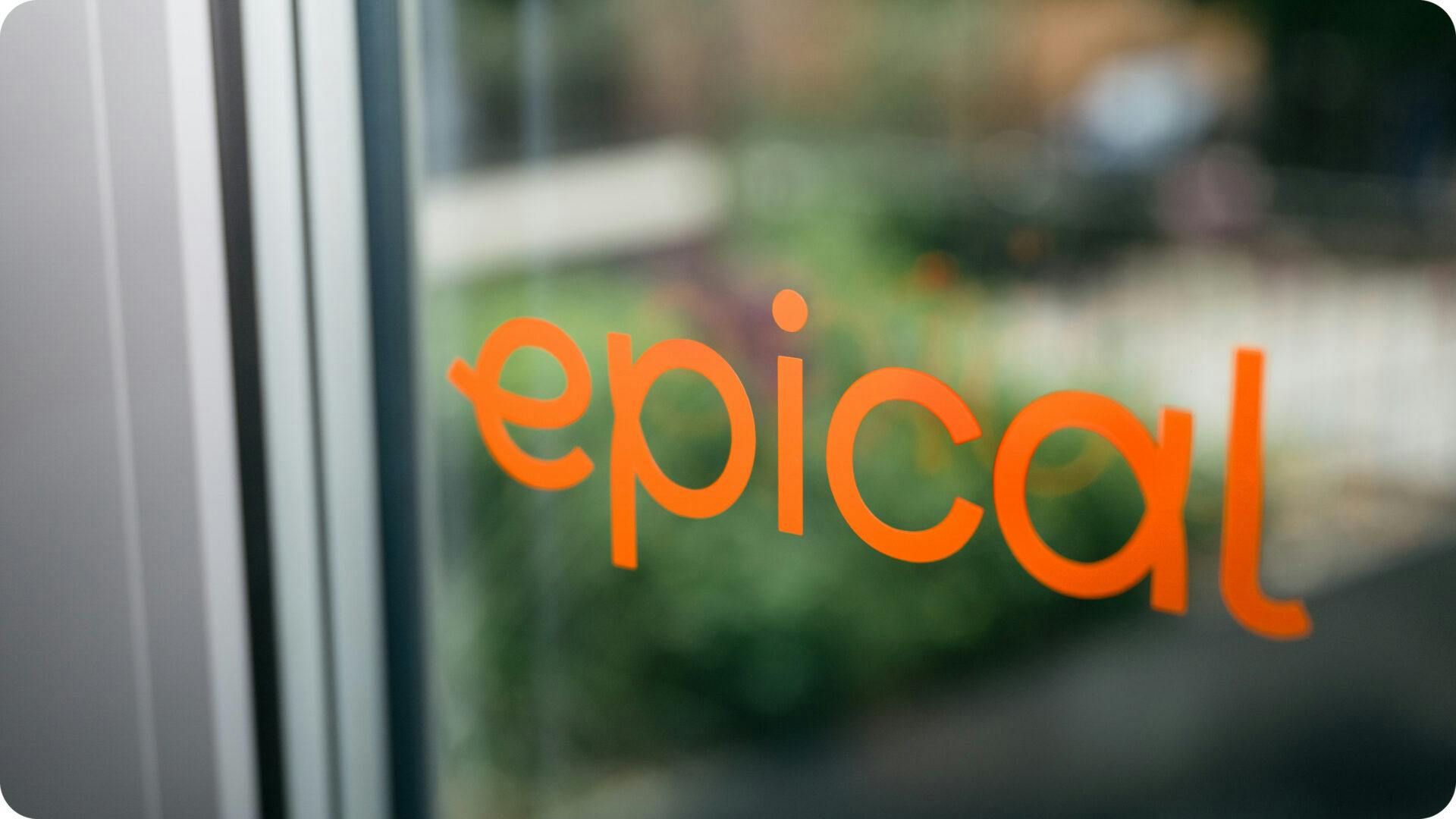
Image Courtesy by Epical
With this foundation, the new identity was built around the idea: “Towards a future we can all trust.” Working with Identity Works, Epical turned this vision into a bold, welcoming, and dynamic brand that reflects its purpose and values.
Why the Change?
The rebranding happened as part of a strategic separation. On June 1, 2023, Enfo’s consulting division became Epical, focusing solely on data consultancy, while Enfo continued as an IT services provider. This shift allowed Epical to sharpen its focus on data management, analytics, integrations, and digital trust—areas where it excels.
By creating this clear division, Epical established itself as a specialist in the Nordics, with a mission to deliver data solutions that make a real impact.
Image Courtesy by Epical
New Logo
The new logo design centers on connecting business with life, incorporating flexibility, warmth, and inclusivity. Each letter in the logo is formed from a continuous loop, symbolizing a modern and forward-thinking approach, which aligns with our concept of “showing the way.”
This design reflects the essence of Epical—guiding clients through the data-driven landscape with expertise and a trustworthy, innovative spirit.

Image Courtesy by Epical
New Color Palette
In a competitive landscape dominated by blue, we wanted to break away from industry norms. Energetic orange was chosen as the primary color, representing life, energy, and human connection. Purple was added as a complementary color to reflect data and security, while pastel shades bring warmth and versatility.

Image Courtesy by Epical
This vibrant combination stands out in the market and reflects Epical’s values of trust, innovation, and inclusivity. Together, the colors create a modern and approachable identity that reinforces the company’s focus on building a brighter future through data.
Agency Collaboration
We knew that rebranding Epical was a major task, and Identity Works played a key role in making it a success. From helping us create the brand name to designing our visual identity, they worked closely with us every step of the way to bring our vision to life.
Our goal was clear: to build a brand that radiates trust, ambition, and warmth, and Identity Works helped us achieve that.

Image Courtesy by Epical
Thanks to their expertise, we now have a cohesive and distinctive identity that truly sets us apart in the Nordics. They provided us with all the tools we needed to bring our brand to life and create something that resonates with our purpose.
Epical’s new identity shows the way for trust-makers all over the Nordics to build a future we can all trust.
It was a rewarding collaboration, and we are proud of the brand we’ve built together.
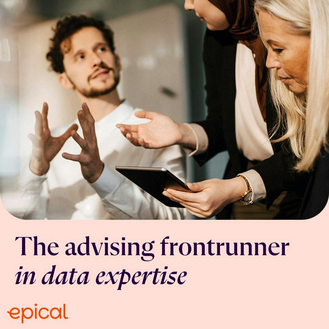
Image Courtesy by Epical
New Structure to Drive Success
The new corporate structure helps Epical focus on what we do best—data. By organizing our teams more effectively, we’ve improved how decisions are made and how our experts work together. This setup makes it easier for us to collaborate and create better, more personalized data solutions for our clients. With everyone aligned, we can work smarter and deliver services that truly meet client needs.
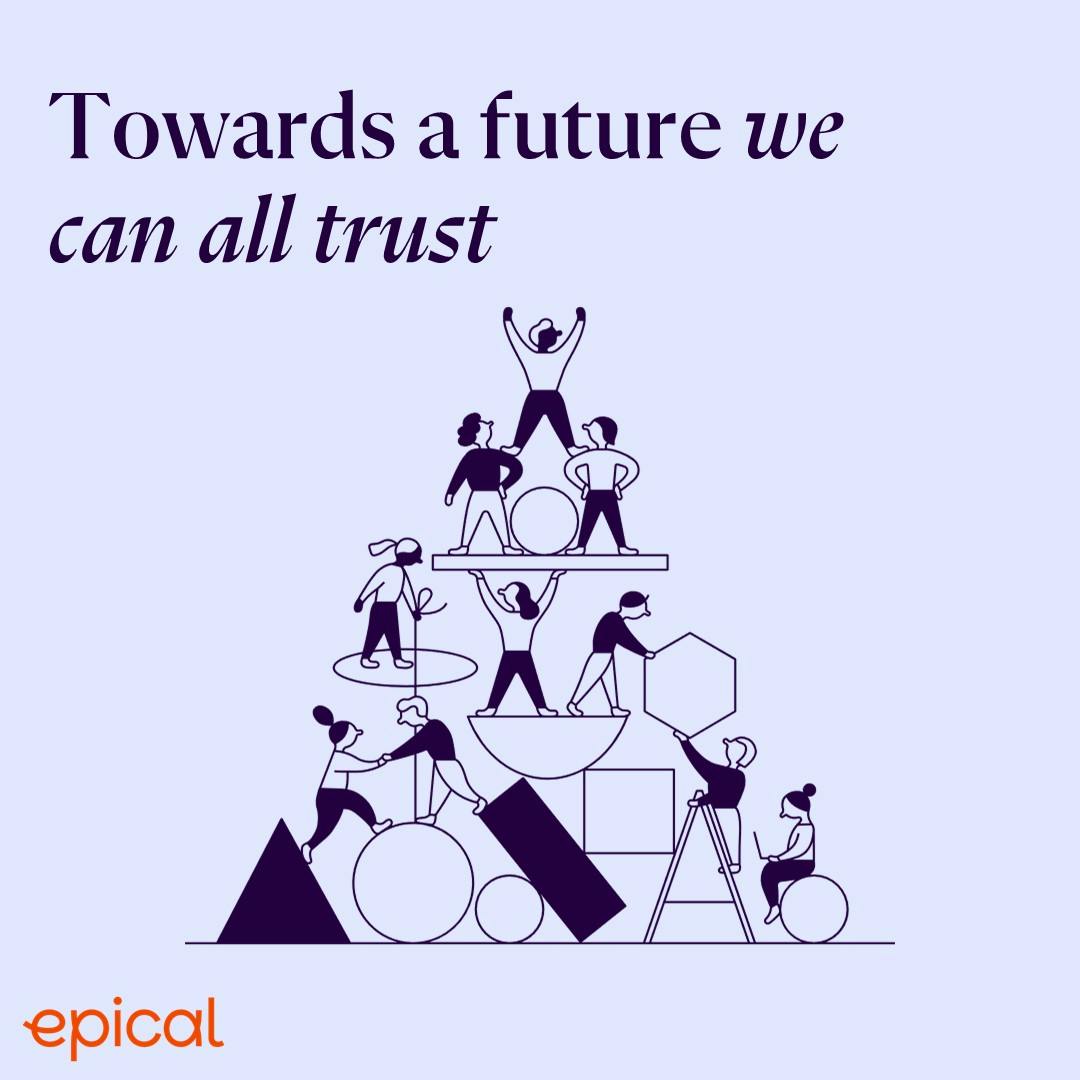
Image Courtesy by Epical
Our approach centers on using data responsibly to make a positive impact. We believe data can solve big challenges and help create a better, more sustainable future. This aligns with our vision of building a trustworthy and data-driven society, guided by our purpose: “Towards a future we can all trust.”
This structure ensures we stay focused and ready to lead in the Nordics.
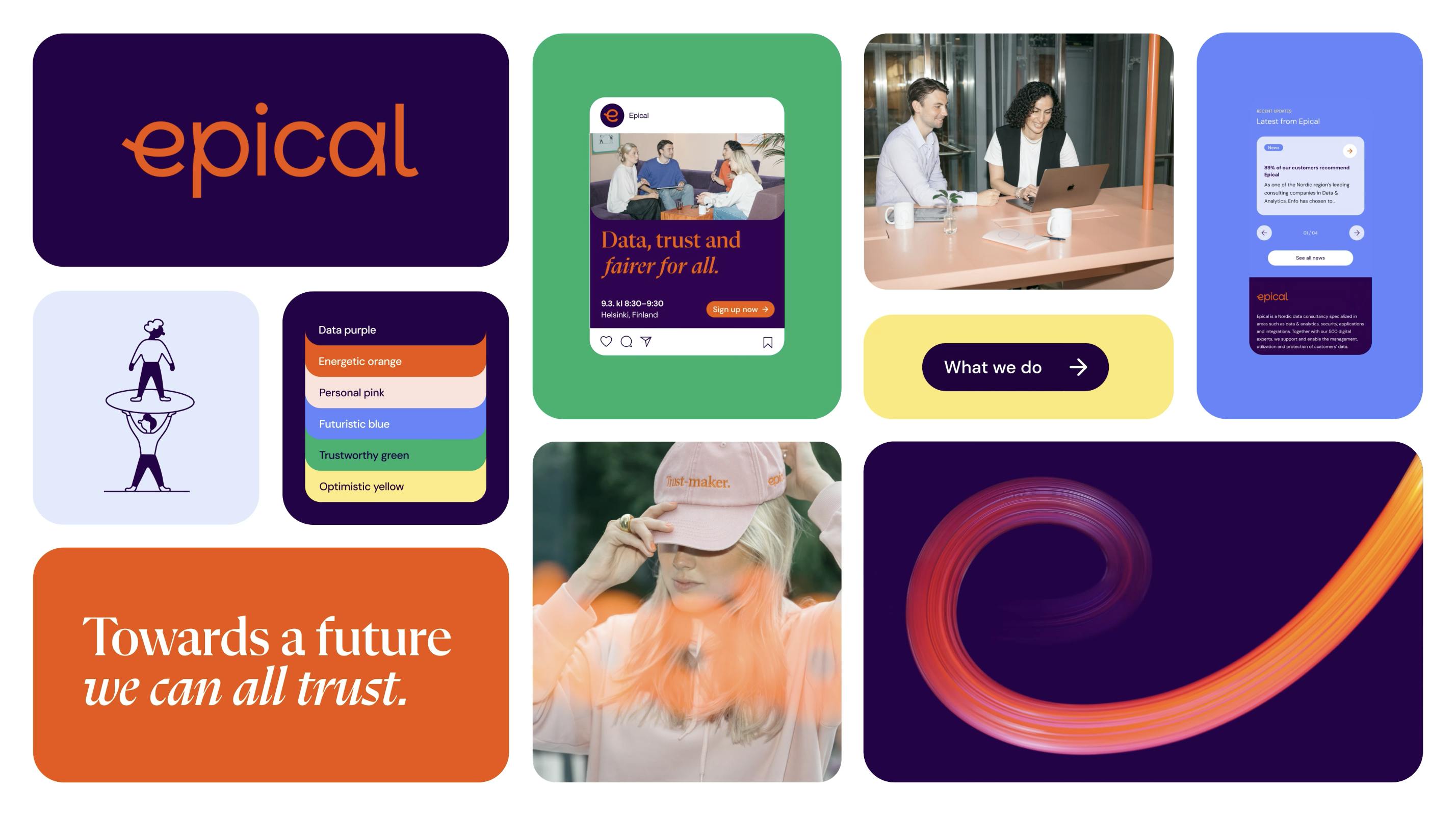
Image Courtesy by Epical
Rebranding Highlight
The journey of building an entirely new brand—from strategy and narrative to visuals—was incredibly rewarding. It was a collaborative and iterative process, involving countless workshops and drafts to ensure the final brand resonated with everyone at Epical.
Opportunities to contribute to such a transformative journey are rare in a career, making this experience truly rewarding.
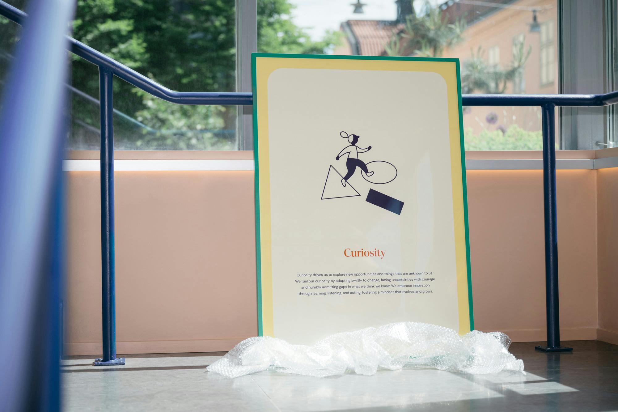
Image Courtesy by Epical
My favorite elements are the illustrations, which we have named as “Epipeople”. They were crafted specifically for us by a skilled illustrator, to depict our services and company virtues in a warm, friendly, and approachable way.

Image Courtesy by Epical
Another favorite element is the 3 dimensional Epiloop, a visual metaphor of a fiber optic cable transferring data and trust, symbolizing the innovative and modern nature of our brand.
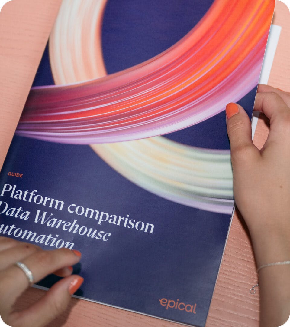
Image Courtesy by Epical
I am incredibly proud that all the elements of our brand work—from strategy and narrative to visuals—came together to form a unique and cohesive brand identity, showcasing the dedication and passion of our team.