

Ryan Bosse is a graphic designer born and raised in Kansas City, now living and working in San Francisco, designing at Stout. His work has been recognized by Type Directors Club, Communication Arts, How Magazine, Print Magazine, Logo Lounge, The Dieline, Creative Bloq and Grain Edit.
Tell us about yourself!
I’m a graphic designer and illustrator creating work centered around branding. Originally from Kansas, I spent eight years in San Francisco and now live in Denver, Colorado. I consider myself part of both cities since I work remotely for Stout and find myself back in the Bay Area often. When not working my day job, I take on limited freelance projects that are either for a good cause or have an interesting story.
My work tends to be inspired by history but modernized to succeed in today’s world. That spans from branding, packaging, illustration, or even my taste in furniture.
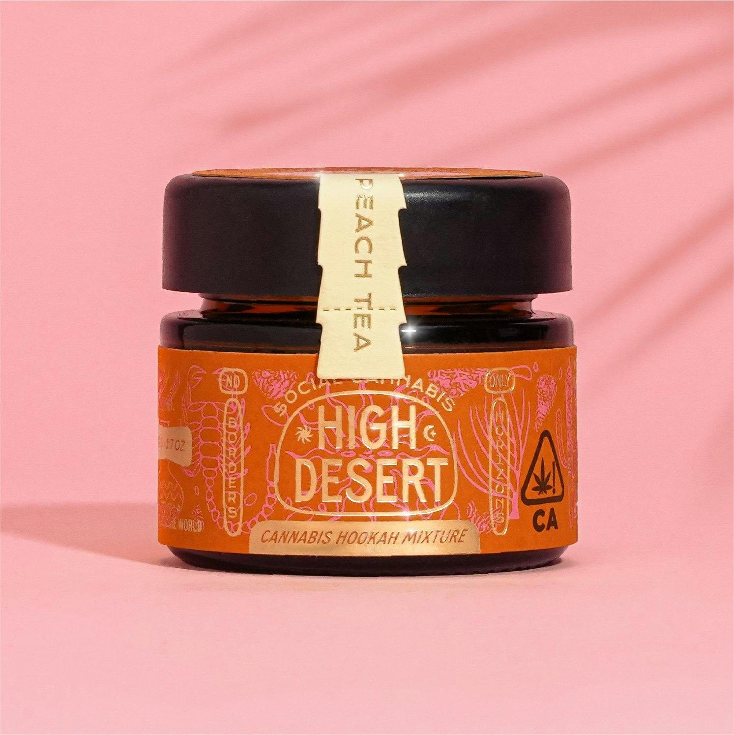
Small container of High Desert.
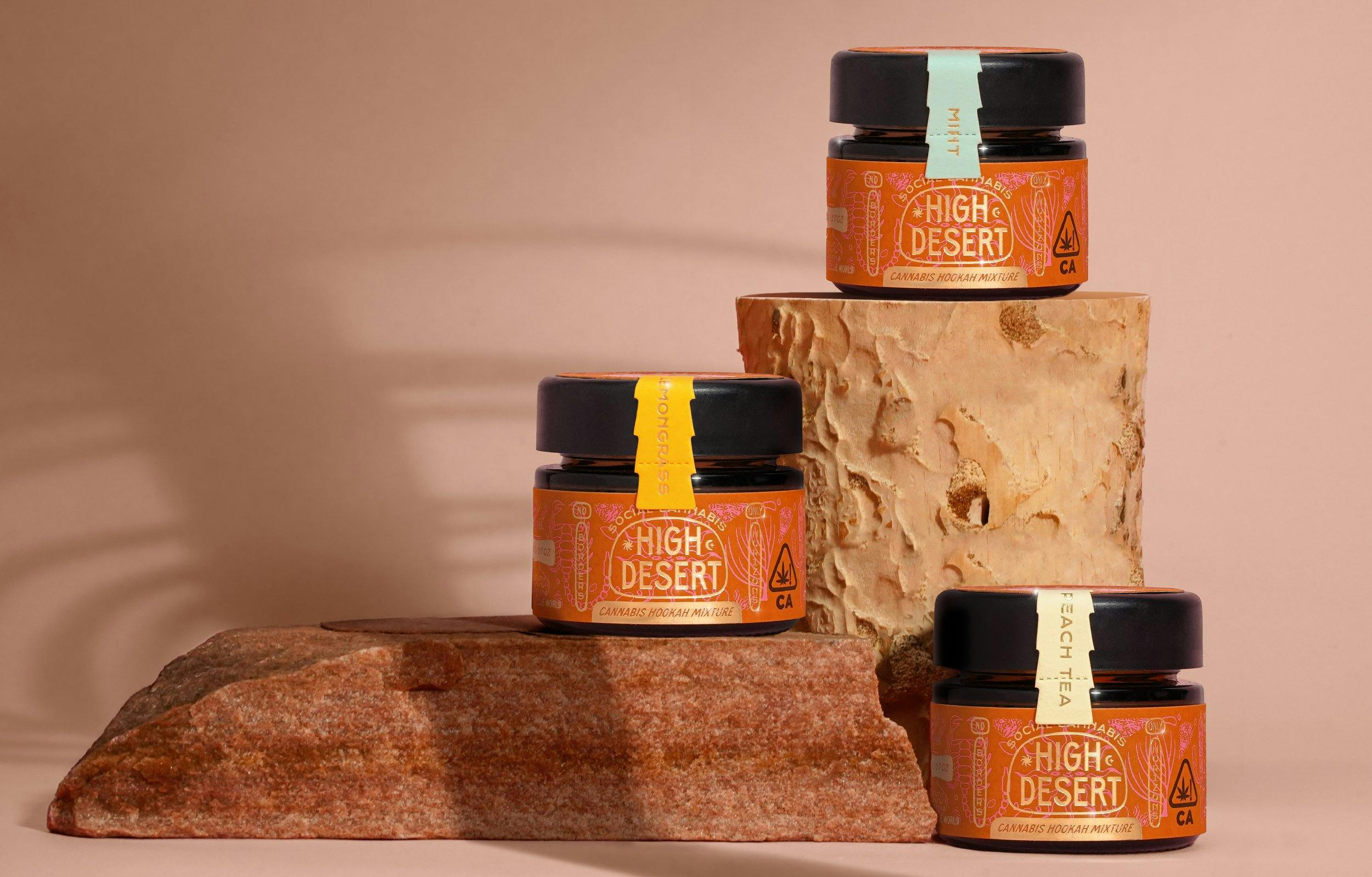
A few containers of High Desert.
Tell us about High Desert and give us a general overview of how you became involved in developing their brand identity.
My wife, Jordan, and I work as a team occasionally when a really interesting project falls in our lap. High Desert fit the bill.
High Desert is a duo in Los Angeles with a vision for a Hookah Cannabis blend of products that center around socialization –– something quite new and unique to the category. After meeting with Oleg and Olga, we recognized this was a small company with big plans and an unwavering standard of quality, so we knew we wanted to be along for the ride.
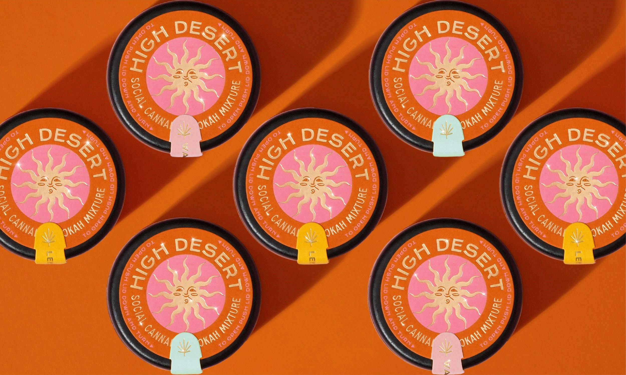
High Desert lids.
How did the design process go? Who were the key players in this project? Was it all smooth sailing? Were there surprising challenges that you encountered along the way?
One great thing about working with smaller companies is that there are a limited number of key players. In the case of High Desert it was just the two founders, Oleg and Olga. This made decision-making and the review process quite smooth and efficient. What also helps with quick decision-making is an almost impossible timeline. We needed a full brand, letterpress packaging, swag, and a website done in about two and a half months, a feat I feared impossible, but thanks to Oleg and Olga’s tenacity it magically got done just in time to present their new brand at Hall of Flowers.
From the beginning, the High Desert team had a vision for quality, not only in their product but across the board from their brand to the production of their packaging to the quality of their swag – a surprisingly rare trait these days. This was the single most attractive thing about the project in the beginning. When dealing with clients who appreciate quality, it makes our job that much easier and creates a sense of pride injected into the process.
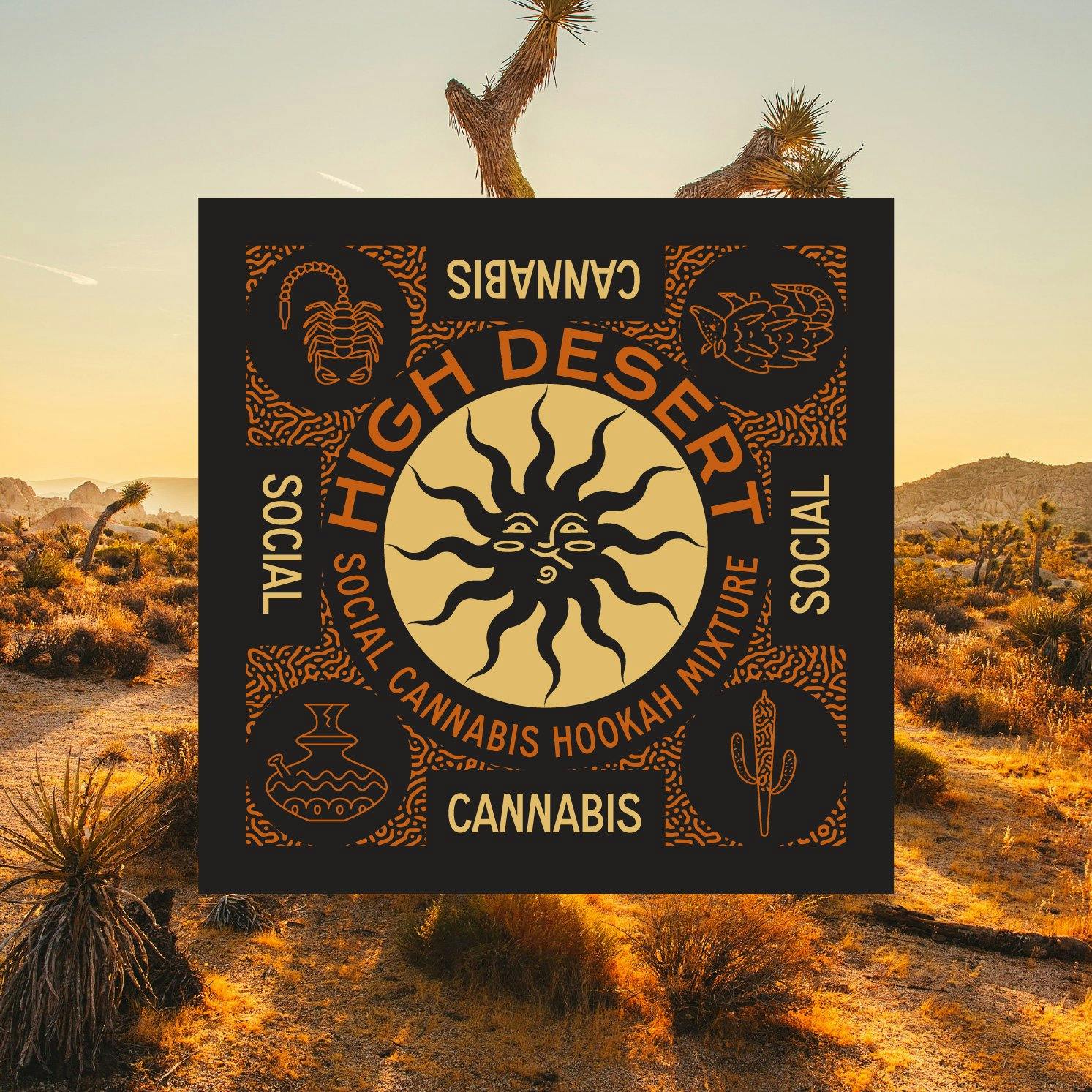
High Desert's Mojave vibe on full display.
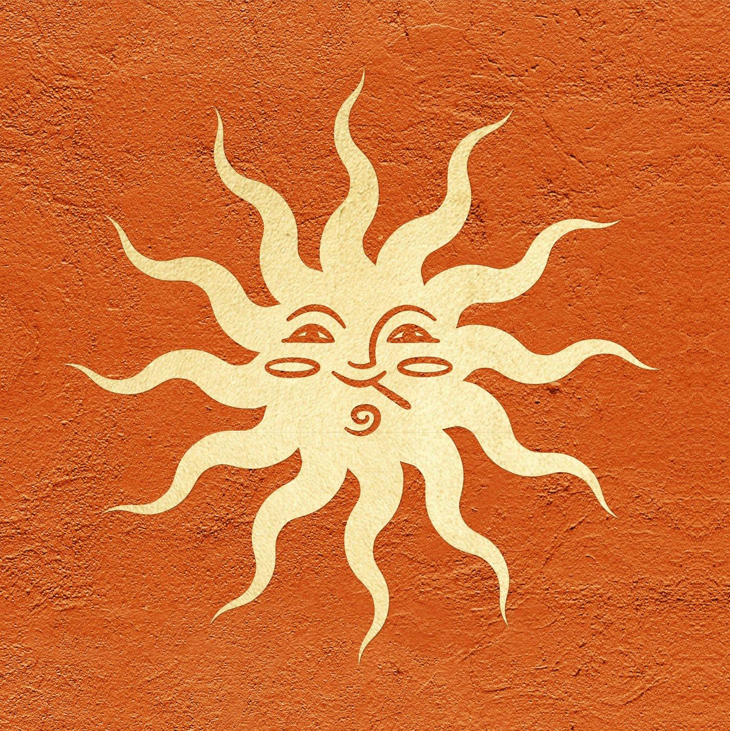
High Desert's smoking sun.
The sun seems to have come out as the brand’s primary logo. Can you tell us about that?
The smoking sun is a visual blend of the two words “High” and “Desert”, as are the illustrations on the packaging. Nothing super conceptual, just a way to have fun and a friendly face welcome you to the brand.
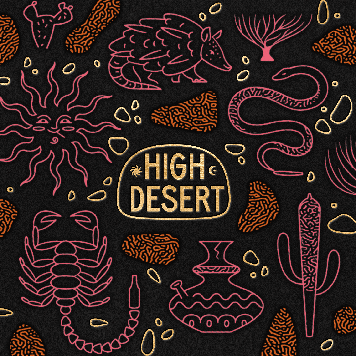
High Desert graphic with elements of the desert.
There’s a very distinctive color palette and aesthetic to the new branding. How did you conceptualize it?
The color palette is directly inspired by the colors of the Mojave Desert: dusty orange, hits of bright desert rose, and a glittery California gold.
Initially, two concepts were presented, Desert Daylight and Desert Nights. Each with its own distinct palette to convey two very different personalities of the desert. Desert Daylight concept was chosen as there was an earthy liveliness throughout the brand.
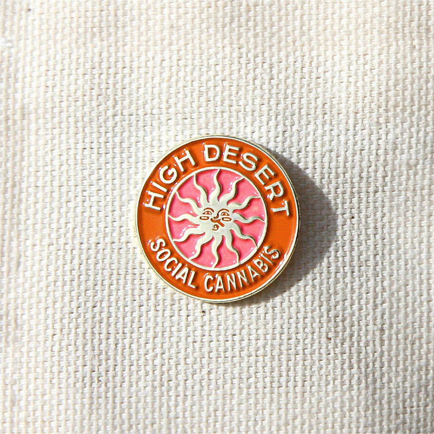
High Desert button.
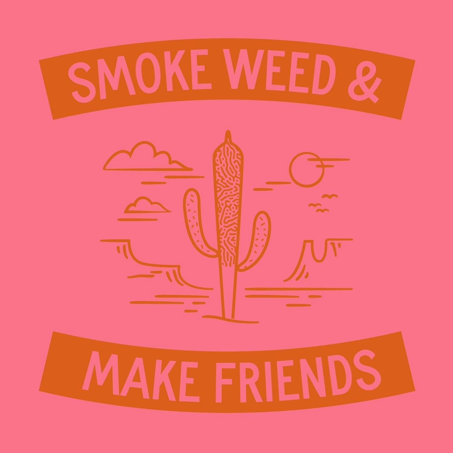
The graphic says it all.
What message are you trying to convey through the logo and brand identity you’ve created for High Desert?
The identity was a simple idea in that it combines elements of the desert with those of cannabis creating a visually rich world with whimsical nods to the experience waiting inside.
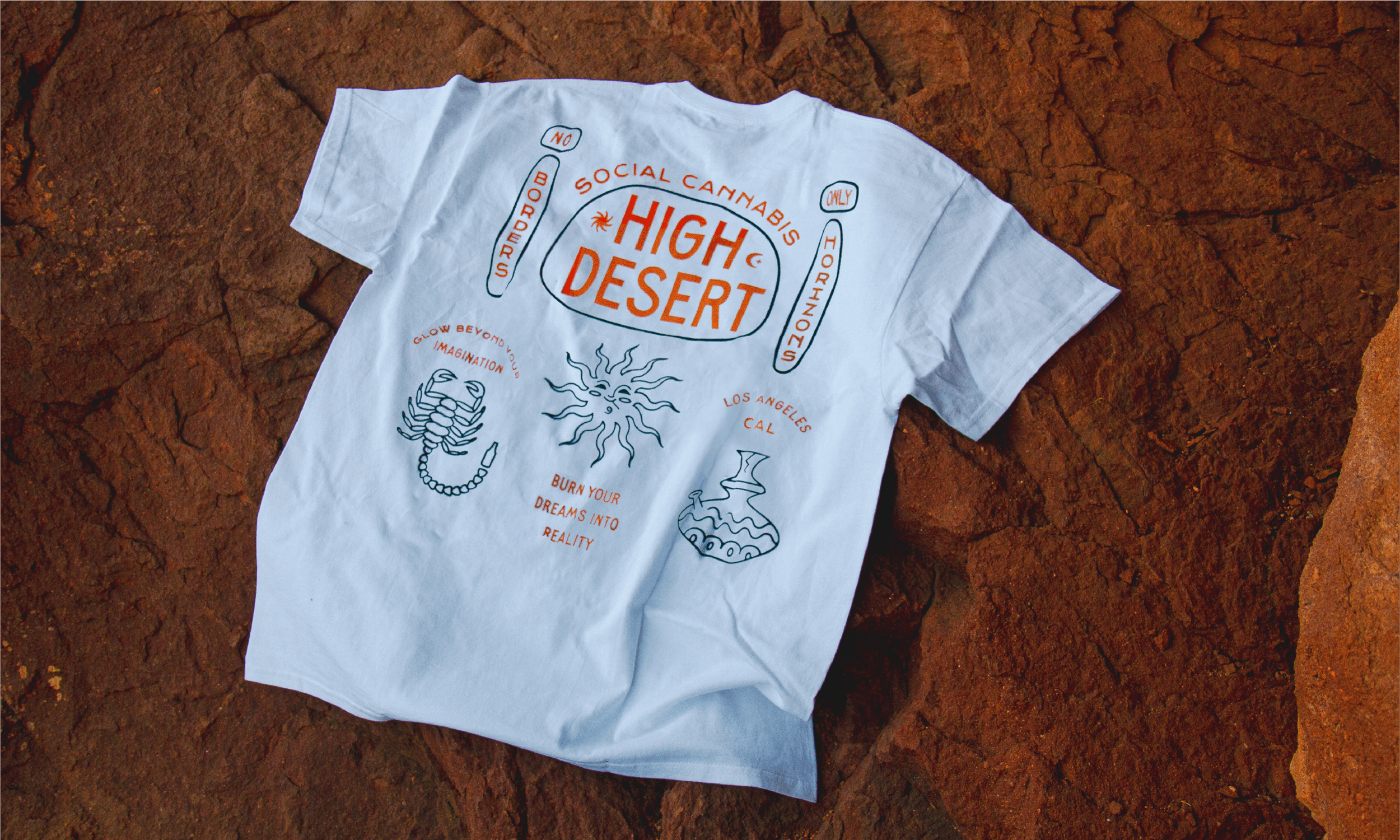
High Desert tee shirt.
What advice would you give to young designers out there?
My advice to designers out there, especially young freelance designers, is try to work with great people. Cool products or good stories are wonderful, but working with and collaborating with great people with a vision will ensure a lasting relationship and successful outcome.
