before

after

Interview with Antonia Delnevo, Head of Brand Design at Synthesia.
Can you introduce us to Synthesia and about the rebranding, how did that conversation start?
Synthesia is the pioneer of the video communication platform, allowing users to easily create videos using AI.
The rebranding idea actually started before I joined the company. Since its inception, Synthesia had experienced significant growth and transformation, but the brand itself had been somewhat of an afterthought, one that we hadn't really invested in.
Over time, it became clear that the brand couldn't take a backseat any longer - we absolutely had to make an investment in it.
While other areas had grown, the brand was left behind in way that it wasn't serving its purpose anymore.
The goal was to have the brand grow alongside the company and to position Synthesia as the company it had become—not a scrappy startup, but an actual full blown company.
So all of those pieces together just meant that it was right time to make this investment and to finally focus on the brand, and not just do a rebrand for the sake of it, but as an evolution of “us”.
Can you tell us more about how the older logo came to be and how it evolved to the new one?
The old logo was inspired by a camera aperture, showing the opening and closing motion.
The logo turned out to be by far the hardest part to finalize during our rebrand process. We went through numerous iterations and worked closely with the global branding agency, KOTO, in a highly collaborative process. There was a lot of back and forth with different options, and it took some time to land on the final design.

The new logo emerged towards the end of the process. We wanted it to signify not just an aperture, but a window into something creative. The design features a canvas or negative space in the middle, symbolizing the limitless possibilities users can create with Synthesia.
The overlapping layers represent the intersection of text becoming video, which is central to Synthesia's function. We loved the simplicity, the rounded corners, and the slanted design indicating motion. Once we saw the logo mocked up on various items like t-shirts and the website, it felt right for us—a cleaner, sleeker version that we needed.
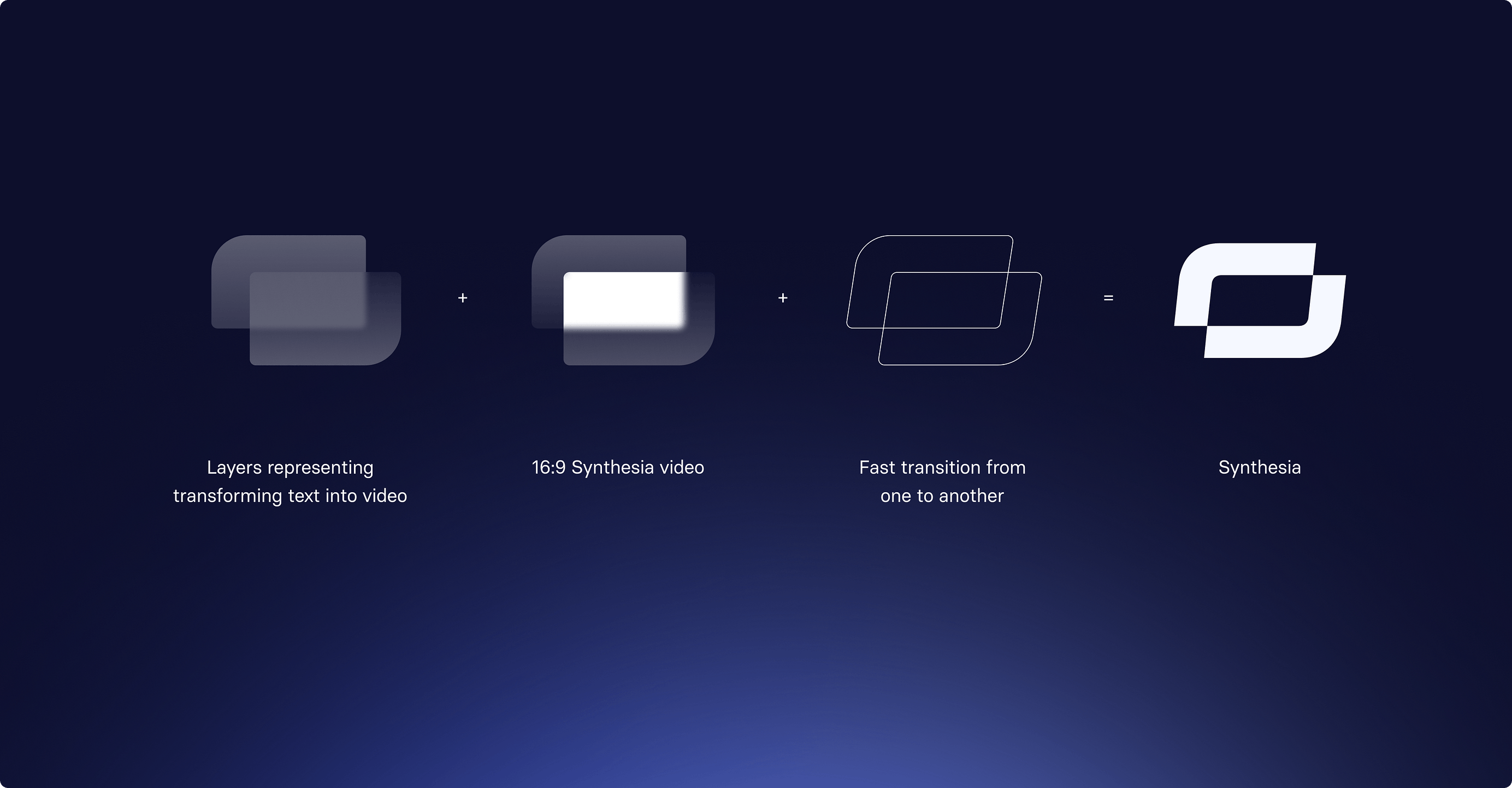
Synthesia logo transition
What was the process behind selecting Indigo 500 as the lead brand color and what does the color Indigo represent for Synthesia?
Initially, we were set on teal and were pretty far along in the process. However, during a product offsite, we realized teal wasn't working for the brand. It was difficult to make teal accessible and to create good combinations with it.
Soon after, during a meeting with the CEO, he expressed dissatisfaction with teal, saying:
You know what? Everything is working for me except the teal. So we're going to have to change this.
We went back to the drawing board, conducted workshops, and tested different iterations. Eventually, we landed on Indigo 500, which we initially called "Blurple" (a term we weren't fond of). Now, we're very happy with Indigo 500 as it aligns perfectly with our brand's identity.
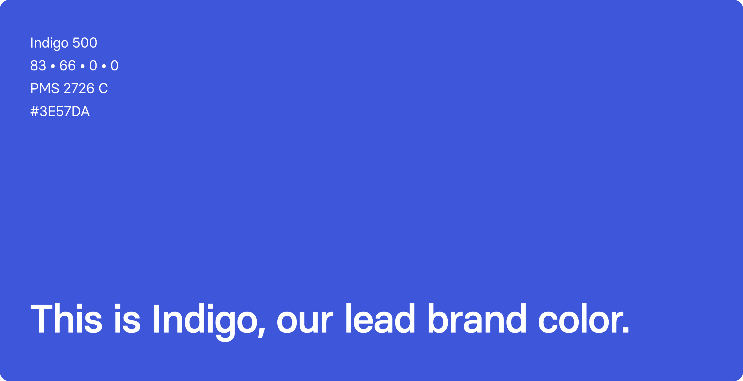
It represents many things for Synthesia. It's modern, fresh, slick, and accessible in terms of color combinations. It makes an impact while still feeling professional and polished. It embodies elements that resonated with us.
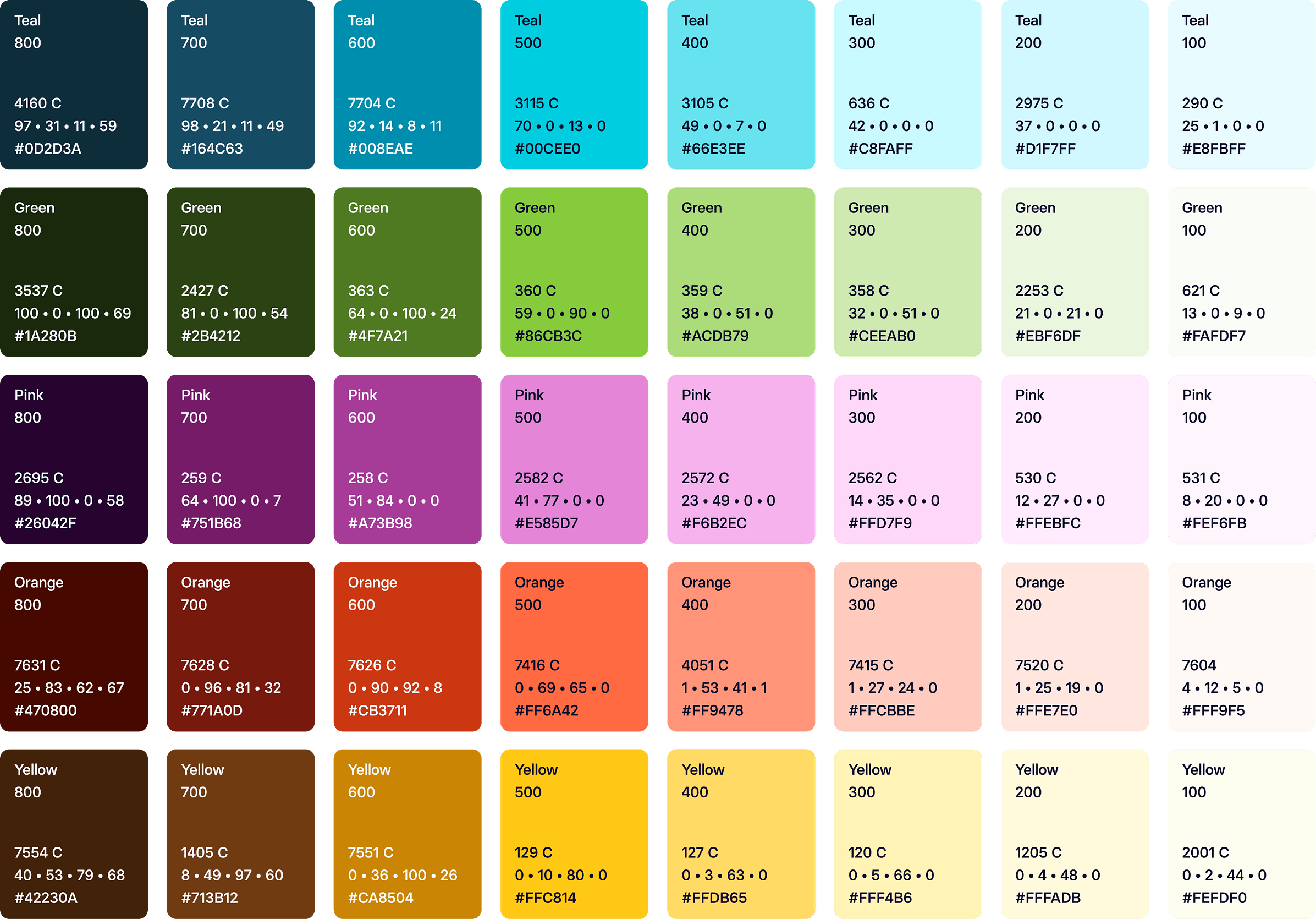
Synthesia complimentary palette
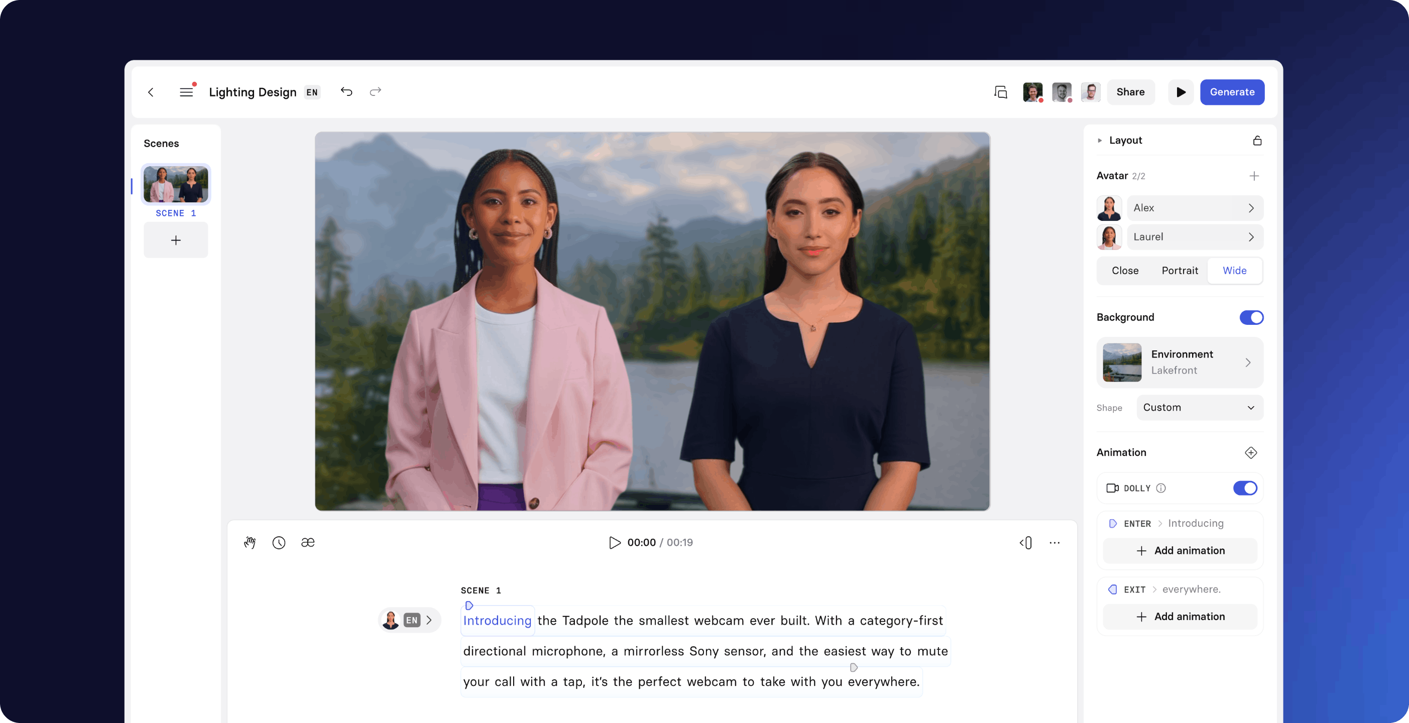
What’s the reasons behind the graphic pattern and the avatar that Synthesia showcase in the website?
The decisions behind this rebrand were marketing-led. We didn't just want a rebrand for the sake of it; we aimed for a rebrand that work for us and wouldn't disrupt our metrics or the way we spoke with our audience.
We learned from testing and user feedback that showing our product and avatars clearly in videos outperformed abstract UI mockups. Since our product simplifies a complex process, it's crucial to present it in a way that resonates with our audience.
We extensively use videos because they communicate better than static images, especially in demonstrating how our tools work.

Regarding the patterns, we needed something unique that felt like ours. We wanted a design language that was present throughout and made us stand out against other companies. We incorporated specific elements like the rounding of the bottom right corner to recall the rounding of our logo, bringing all these elements together in a cohesive way.
How did you put the rebrand together with different agencies, and what was your approach?
We initially worked with another agency for a few months, but we didn't gel well and couldn't achieve the desired results, unfortunately. Parting ways with them was tough, but it taught us valuable lessons we applied when working with the next agency, Koto.
There was a consideration to do the rebrand entirely in-house, but we needed the extra push from a great agency. Working with Koto was more collaborative; we often exchanged designs and feedback, which isn't always the norm but worked well for us.
The rollout was done in-house, applying the design language, brand guidelines, and assets provided by Koto into a proper design system. The website redesign, for example, was done entirely in-house, reflecting the collaborative and iterative process we established with Koto.
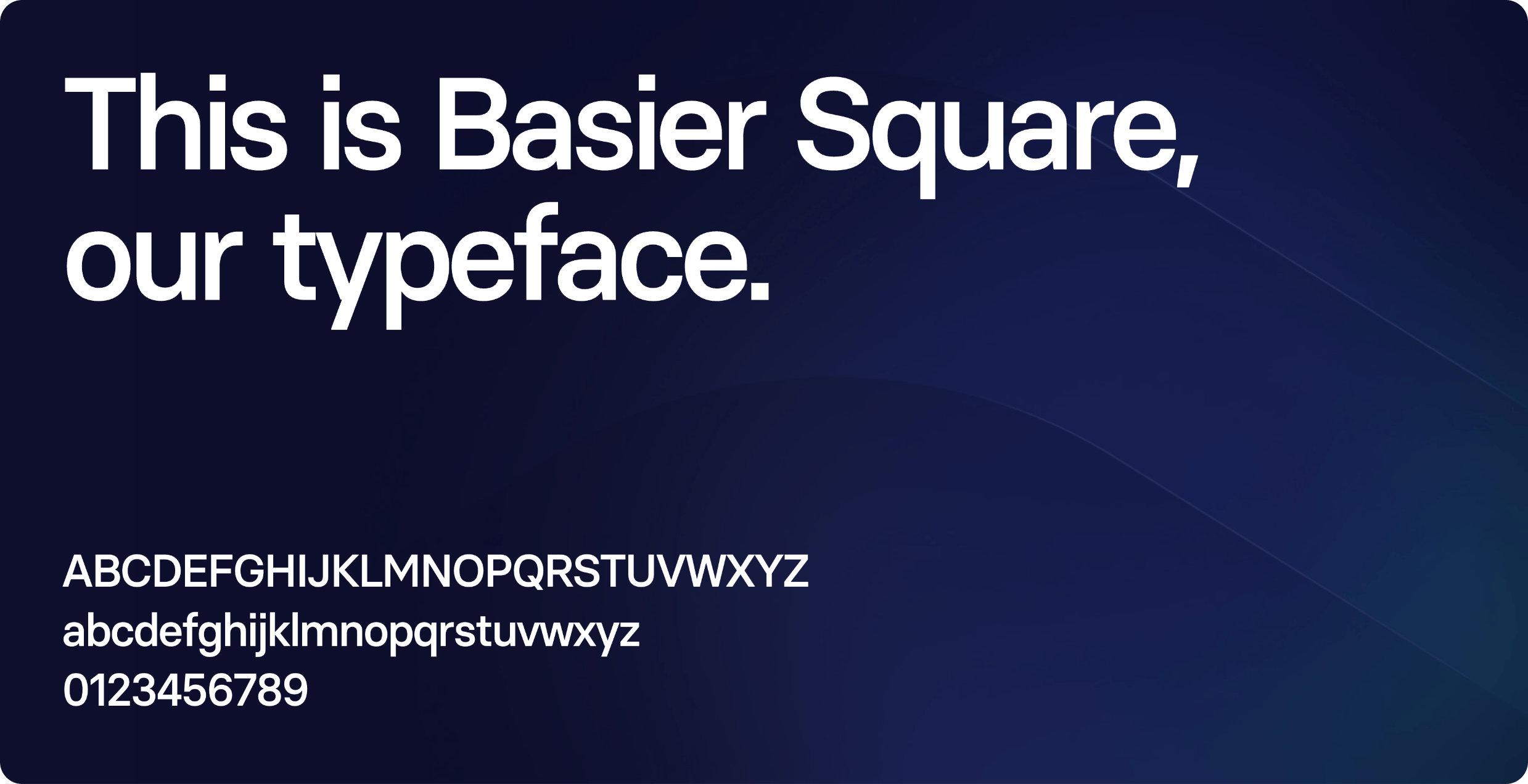
Synthesia font family
How does this new brand identity reflect Synthesia's unicorn status and $1 billion valuation?
Our new brand identity reflects how we've grown up as a company. It communicates that Synthesia is a unicorn, a company doing something unique in a very special way. More importantly, it shows the world that we are no longer a scrappy startup but a valid option for enterprise customers and large companies.
We need to be trusted by big companies, and our brand needs to convey that trustworthiness, rather than suggesting we're still figuring things out. We feel very confident about our market position.
Becoming a unicorn, with a $1 billion valuation, happened at the right time. It feels like all the pieces are fitting together. Our new brand communicates that we are enterprise-ready and an important player in the market.
What are the key steps you are most proud of? Do you have any personal anecdotes about challenges or interesting trivia during this process?
The biggest challenge for me was being the middleman between various groups involved in the rebrand. We had the agency, the core rebrand team, the larger design team, the product design team, and the rest of the company. Managing all these different opinions and workflows was quite difficult, especially on such a large scale.
I love project management, but it was definitely challenging, especially during key moments of the project, such as when we were disagreeing on the final logo or the primary color—both pivotal elements.
It was crucial to understand everyone's perspectives and work through these disagreements to find a solution that made everyone, or at least most people, happy. I'm really proud that we managed to do that, persevering through the challenges.
When we unveiled the new brand at an all-hands meeting in May before the external release, the response was overwhelmingly positive, and it really just made it all feel so worth it.
Any tips of managing egos and expectation while working with people, especially in the design field, how do you approach this and how do you do it?
The key was having a restricted brand committee with the main decision-makers: myself, the VP of Marketing, the Head of Product Marketing, and the CEO, and COO, who are our co-founders. If disagreements arose, the VP of Marketing would make a call, or our CEO if needed. This clear hierarchy resolved conflicts effectively.
When it comes to managing everyone else, I would say:
Taking your own ego out of it, because you may have been working towards this for weeks or months, but if someone is giving you feedback, take away the ego and actually listen to what they're saying.
It's important to sit with feedback for some time, play around with different options, and decide whether it's something to apply or if it's just a matter of personal taste.
Creating spaces for brainstorming and workshops where everyone can contribute was also crucial. Allowing time to freely test ideas, like during a product offsite, was super important.
In summary, having a well-defined set of internal stakeholders with clear roles and allowing external stakeholders to give constructive feedback in designated spaces were key to managing egos and expectations effectively.