
before

after

With over 10 years of experience ranging from fashion to healthcare and cannabis to CPG, Super Okay's Creative Director Anthony Cappetta has a passion for creating visceral and niche brands that transcend culture and expected demographics. He believes the unexpected and nuance of visual language are a brand’s greatest assets alongside the products themselves.
Can you tell us how this project came about? How did that conversation start with TCHO?
It was a fairly organic one, to be honest. I’d worked with Josh Mohr (TCHO head of marketing) previously in my career and when TCHO decided to go through the rebranding process, Josh reached out to get my opinion on some of the foundational work they’d done and the Super Okay working relationship with TCHO on the project grew from there.
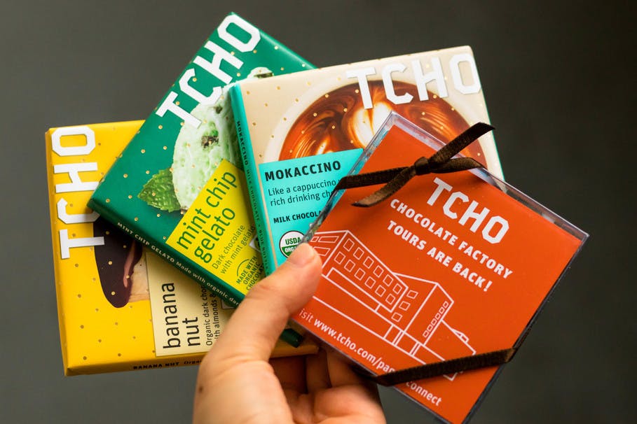
Previous TCHO packaging
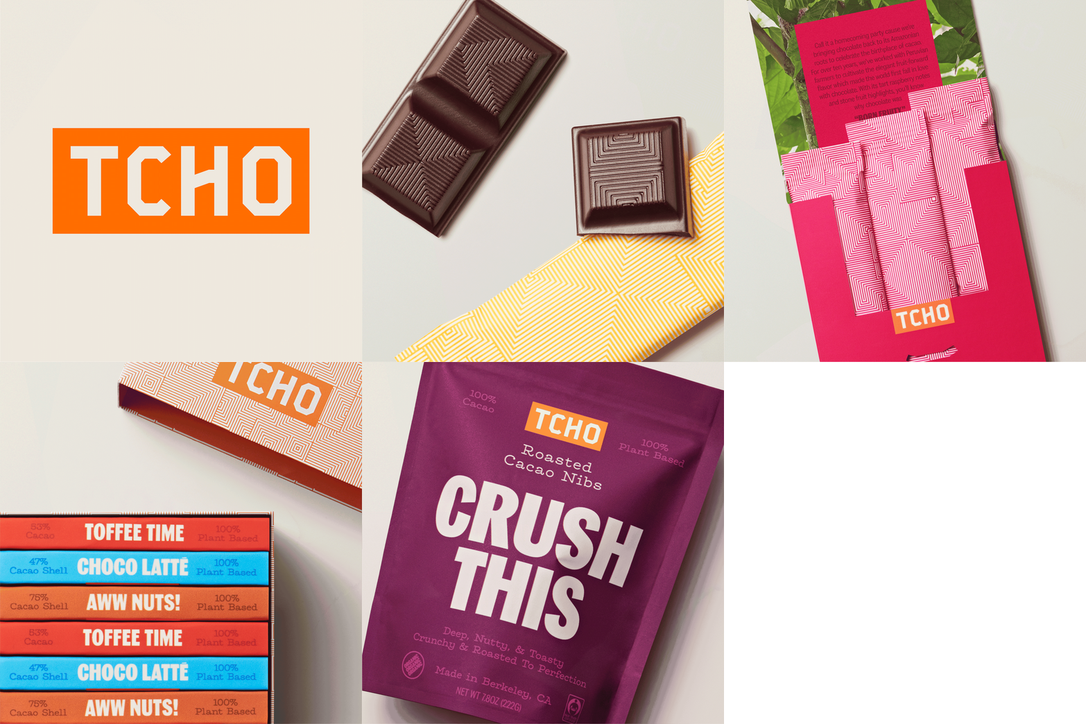
TCHO new packaging
How did the branding process go? Can you tell us more about it? Where did you start?
We started out by assessing and re-establishing the foundational principles for the brand, working with TCHO to craft and sharpen their mission, vision, and values whilst also landing on a core brand idea; something to help drive the brand into its next phase.
Alongside this work, the company was going through a fairly radical evolution, taking the steps to become B Corp certified and 100% plant-based, which gave us a very strong foundation from which to build out these principles and ultimately led very naturally to the ‘Chocolate. Fair & Square’ concept. This became both a powerful brand idea and a great tagline. From there we dove into creative exploration and began refining the various equities to reflect the direction that we wanted to take the brand.
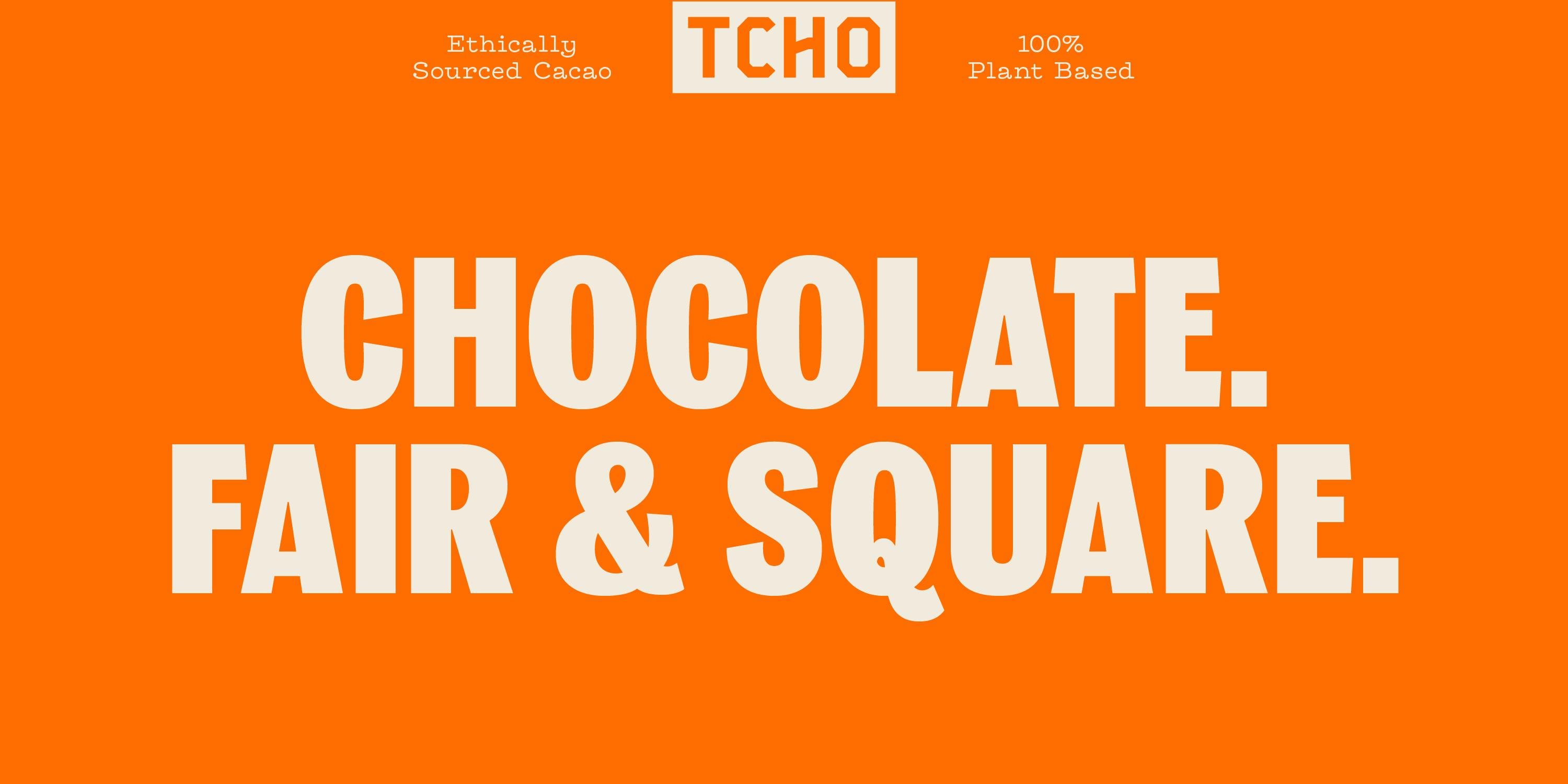
"Chocolate. Fair & Square" is a striking slogan. How was this conceptualized?
It’s a mixture of the ethos and values of the company combined with the distinctive product form that the company chose for their bars. It all comes back to what makes their chocolate so unique and the experience of eating it.
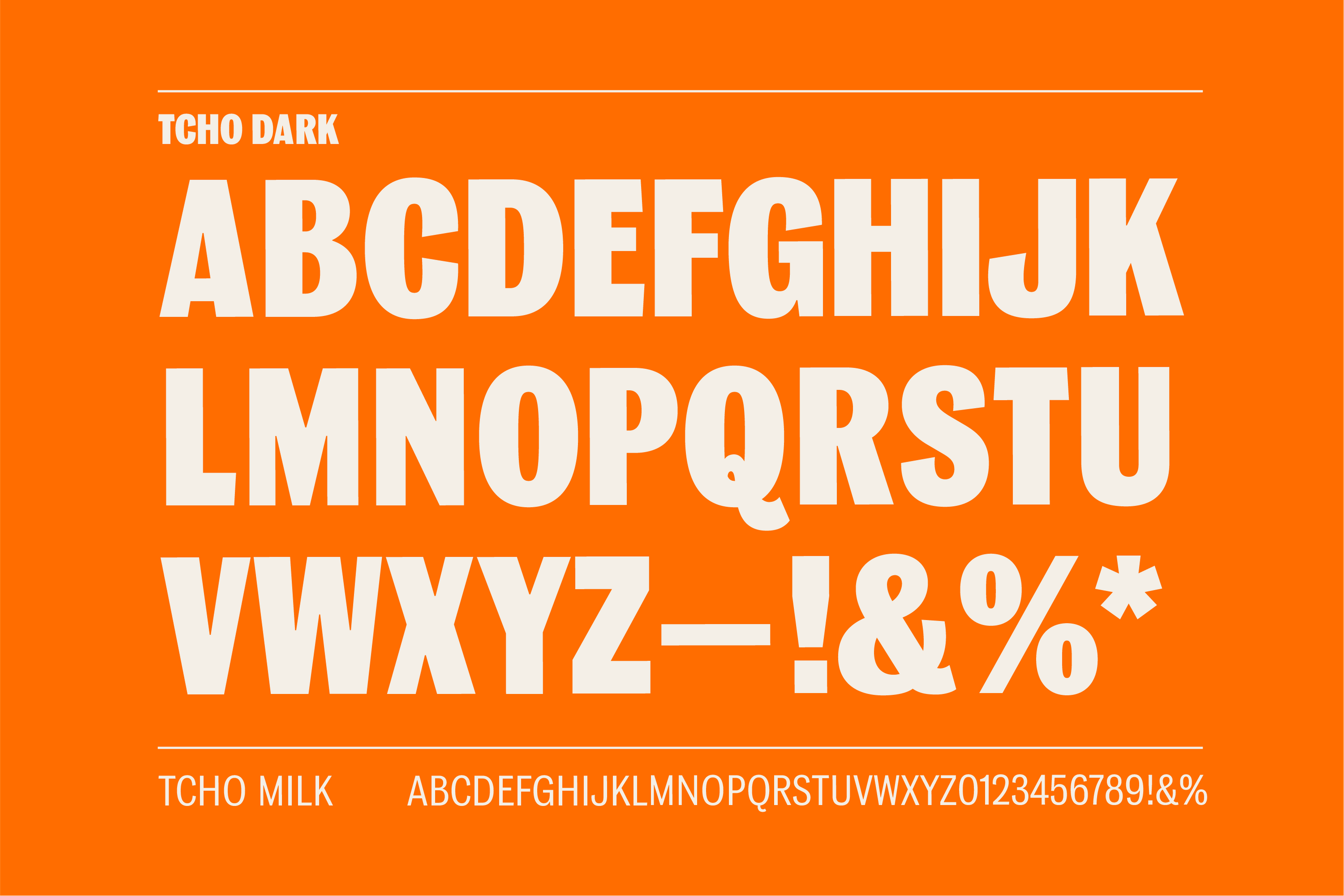
TCHO Typography
Were there surprising challenges you encountered along the way?
Like any ambitious project, the lines rarely run straight and this was no exception, particularly as the client's ambitions increased as we got deeper into the project. What started out as a packaging/brand redesign morphed into the client ripping up their operating playbook, sunsetting previous product lines and developing entirely new plant-based bars.
And with that decision, everything changed. New recipes, new flavors, new bar names, new bar molds, new chocolate making machines -- basically the only thing that stayed the same was the original logo that Erik Spiekermann designed and we had a huge amount of love for. It was an incredibly brave moment for TCHO and speaks to the depth of their commitment to their values that they took such a radical approach and we feel hugely fortunate to have been invited along on the journey.
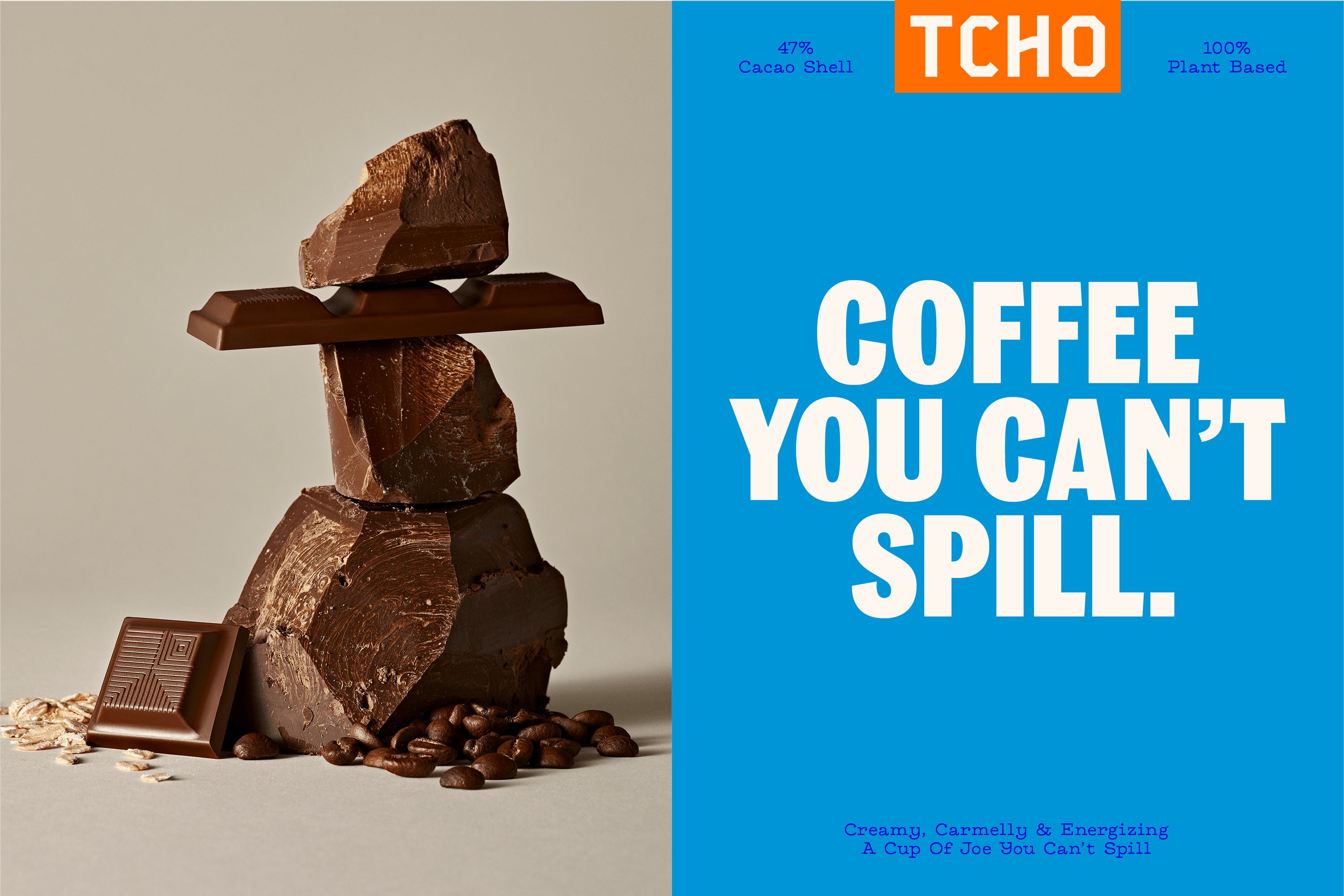
Can you talk about TCHO’s new photo direction, “flavor lust”?
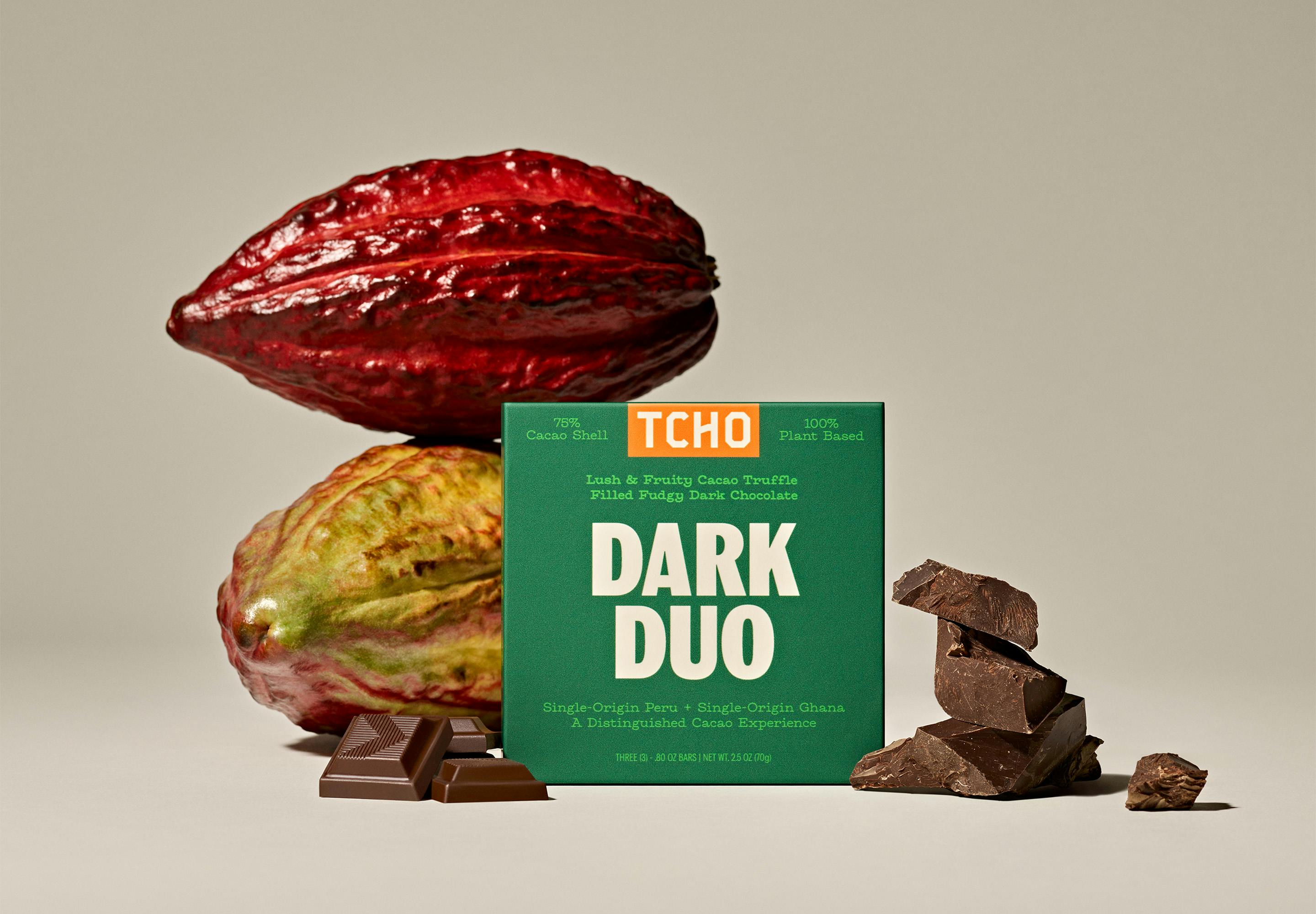
With such a huge emphasis going into the recipe innovation for the new bars and in particular an obsession over using quality ingredients, sourced ethically and transparently, we wanted a photo direction that felt elevated, premium and really championed the ingredients in a beautiful way. "Flavor Lust" is our way of celebrating what's inside of each bar, drawing the consumer in and educating them on what goes into their favorite TCHO recipes.
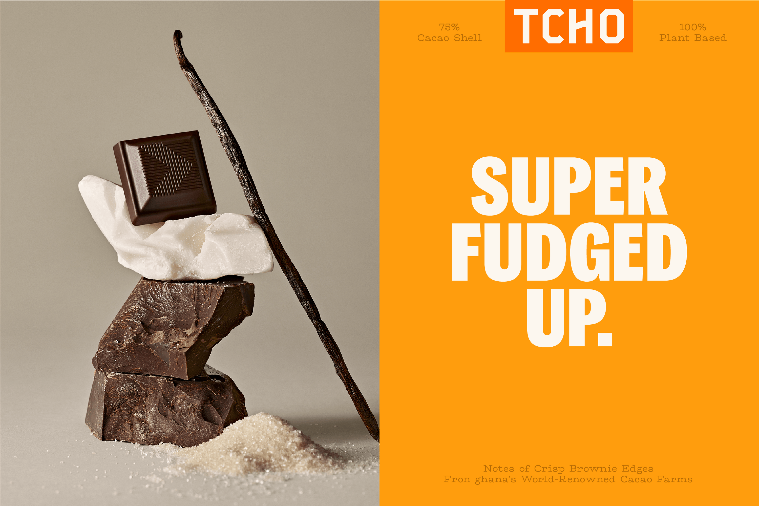
How did you land on TCHO’s new vibrant color palette, especially the orange? What do these say about the brand?
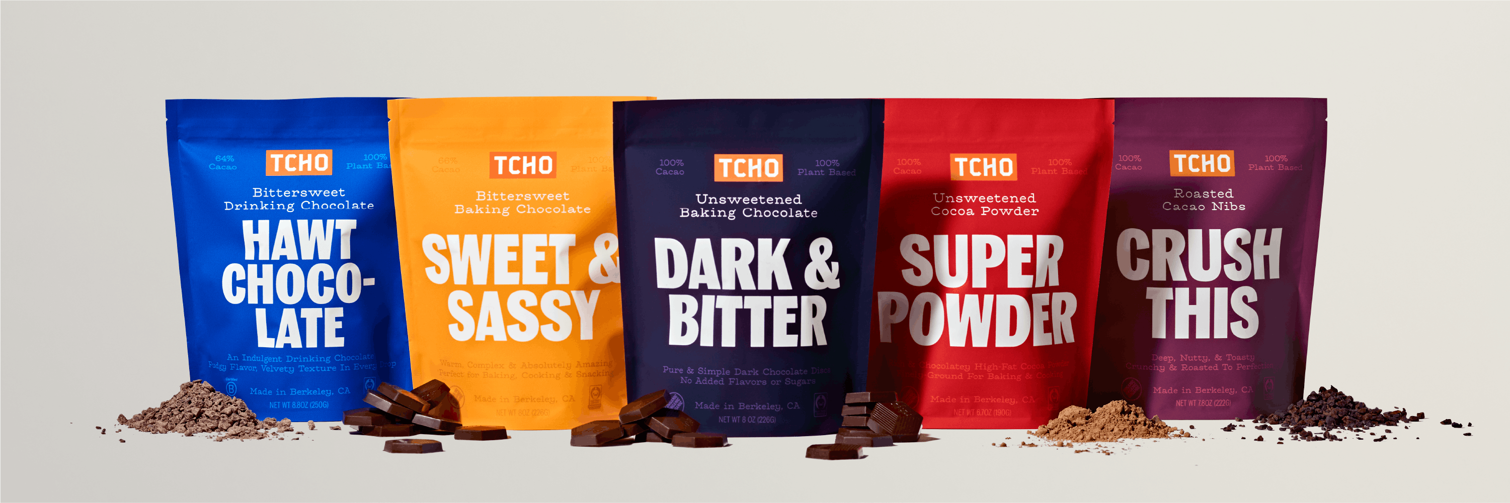
TCHO has historically been an orange brand. In our analysis of where the chocolate industry is and where we thought we could take TCHO, we knew the orange was distinctive and an equity we wanted to keep but we knew we wanted to pump more vibrancy into it to help it stand out on the shelf and contrast with a lot of the other craft chocolate brands that tend to go with more muted colors.
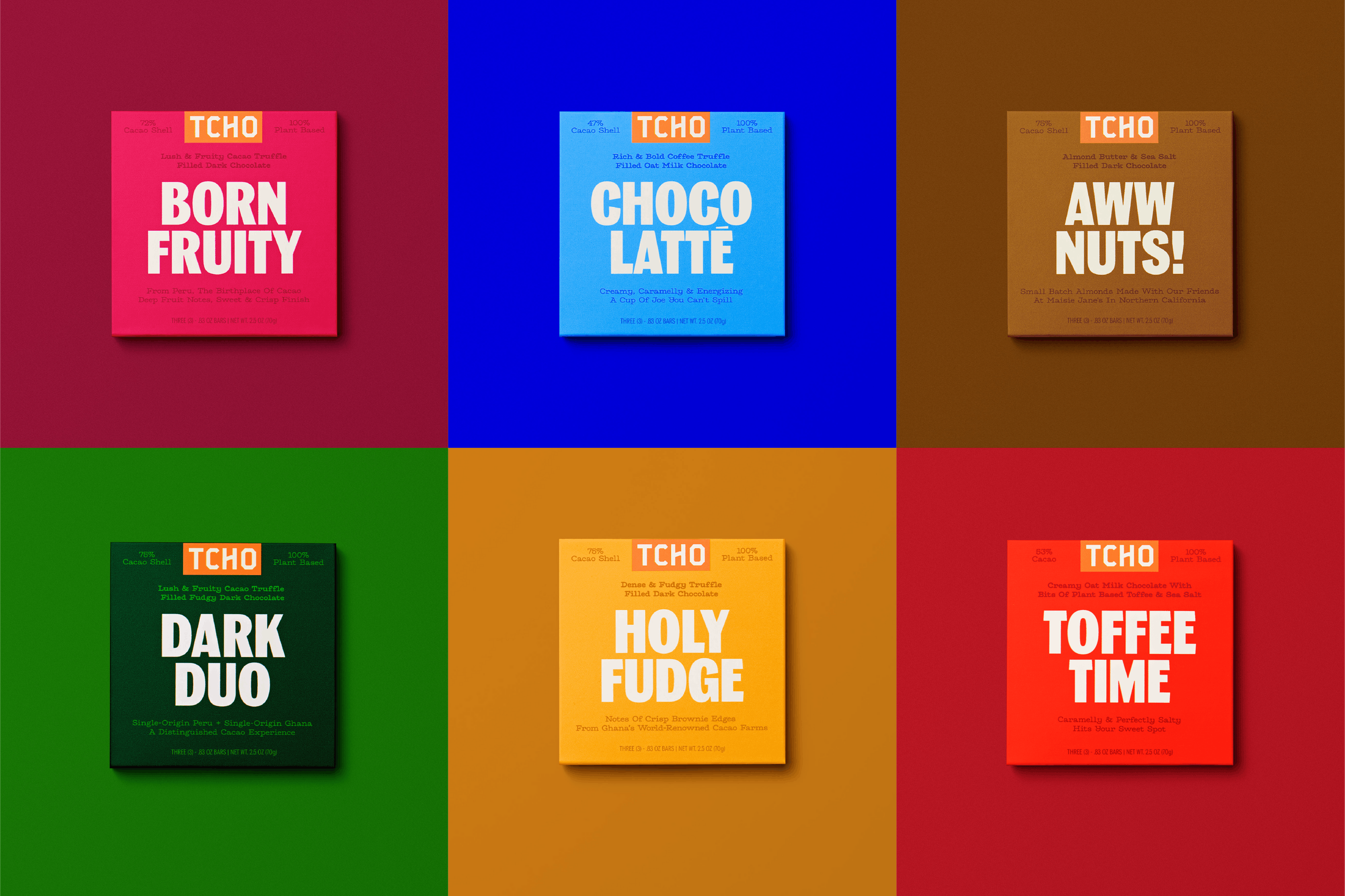
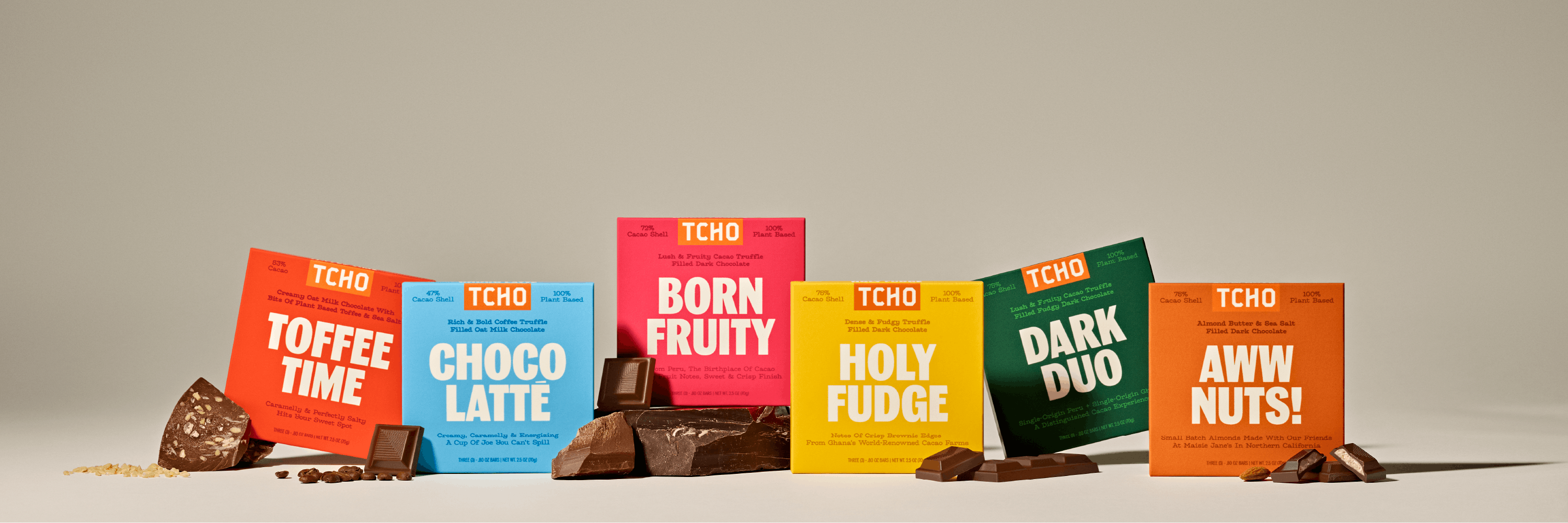
TCHO Bars
The wider color palette takes its inspiration both from the ingredients and the origin of the chocolate. Each of the six bars that TCHO re-launched with has some reference to either flavor or origin. If you look at the ‘Holy Fudge’ bar, for instance, the yellow in the packaging is close to the color of the Ghanian flag and represents the region that the bar is from. If you look at Born Fruity, the Fuschia is a distinct color found in Cacao pods from Peru (another reference to bar origin), whilst Aww Nuts! Is clearly inspired by the color of the flavor cue.
It’s a color system that's intended to grow over time as they launch more flavors and take the brand into different places.
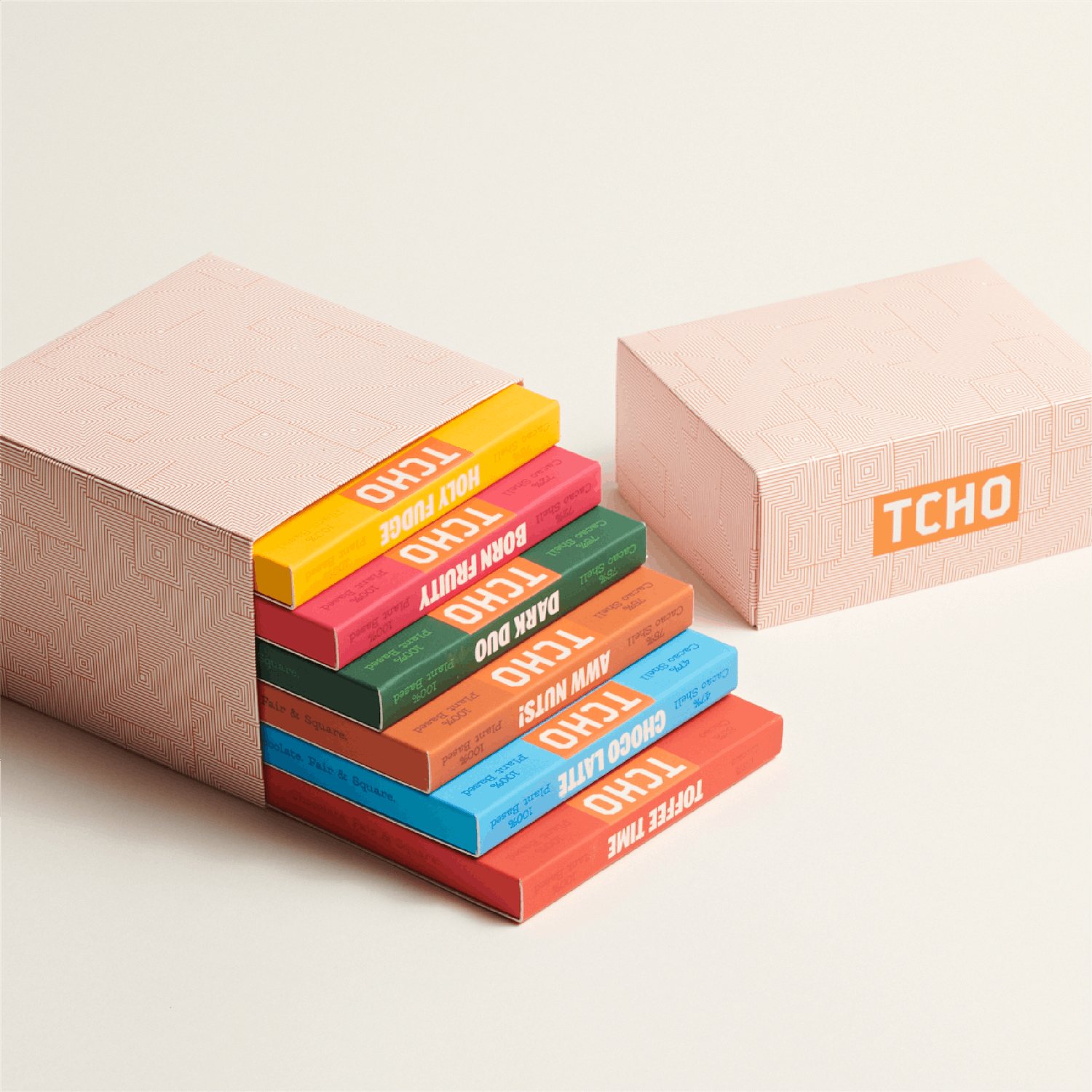
TCHO Gift Box
The packaging also changed significantly with the new pattern and the bold typeface. How were these designs developed?
When we were going through different packaging concepts, this idea of being very type-centric and language forward really resonated with the client. It’s distinctive in the category where there is a tendency to be very image forward, so the idea of using language and typography made a lot of sense from a positioning point of view.
From there, we worked with Colophon to create a custom typeface for the brand that we felt complimented the level of craft and premium-ness that went into their products. The TCHO typeface is largely inspired by European wood type and is handcrafted to reinforce the idea of craft premium chocolate.
The new pattern came about a little later in the process when we were discussing some of the original brand design work done by Erik Spiekermann and his team. The original TCHO packaging was clad with a gold foil pattern that had got lost over the years as the brand evolved. The pattern represented the history of chocolate’s early days as currency in Central and South America. This subtle touch is something we wanted to bring back with the new pattern design and we ended up flipping the original Spirograph pattern into a concentric square pattern that reinforces ‘Chocolate. Fair & Square.’ positioning.
Lastly, do you have any advice or pro-tips for designers embarking on branding projects like this?
Good design is only as good as the relationships you build with the client. There is plenty of great design out there that never makes it into the world because the right trust/relationships aren't built behind the scenes to support its realization.
We were fortunate enough to have a working relationship where there was a deep trust between us and the client that enabled the work to reach a level that we’re collectively really proud of.
So for instance with the typography, we were really fortunate in Josh, to have a client who understood the necessity of having custom type given the direction we’d collectively agreed upon, and it was the trust we’d built that led TCHO to make that incremental investment and ultimately push the brand to places that we don't think they would have reached without it.