
before

after

Stephanie McDermott, Brand and Creative Lead at Washington State Parks, shares the design details behind their new brand since the 60s!
Can you introduce us to Washington State Parks and the brand’s identity through the years? How were the past brands conceptualized?
At Washington State Parks, our highest purpose is to make the outdoors joyful for everyone from the first-time visitor to the casual explorer, the expert adventurer and for generations yet to come. No matter how you choose to connect with nature, state parks are here to welcome you into the wild, wonderful outdoors.
Washington State Parks previous branding
Our identity has remained relatively unchanged since the 1960s when one of our employees sketched the scene that was used on the badge.
At the time, the “logo” was essentially an agency shield worn on uniforms or a wooden sign etched for park entrances. It was created for utility and had a specific tacit purpose.
About this current rebranding, how did it come about? How did that conversation start?
The pandemic changed the way we interact with each other and with the spaces around us.
In the height of the pandemic, nature became the only safe space where we could connect with each other and we saw record numbers of people in our parks. We decided to use this opportunity to capture that reconnection with nature and outdoor recreation.
We needed a north star, a point on which to focus and work toward to ensure that people from all around the state, of all ability levels feel welcome and wanted in the outdoors.
How did the rebranding process go? Was it all smooth, or did you encounter challenges?
Overall it was a really positive experience, we made sure that we were intentionally soliciting feedback and early buy-in from a wide variety of stakeholders.
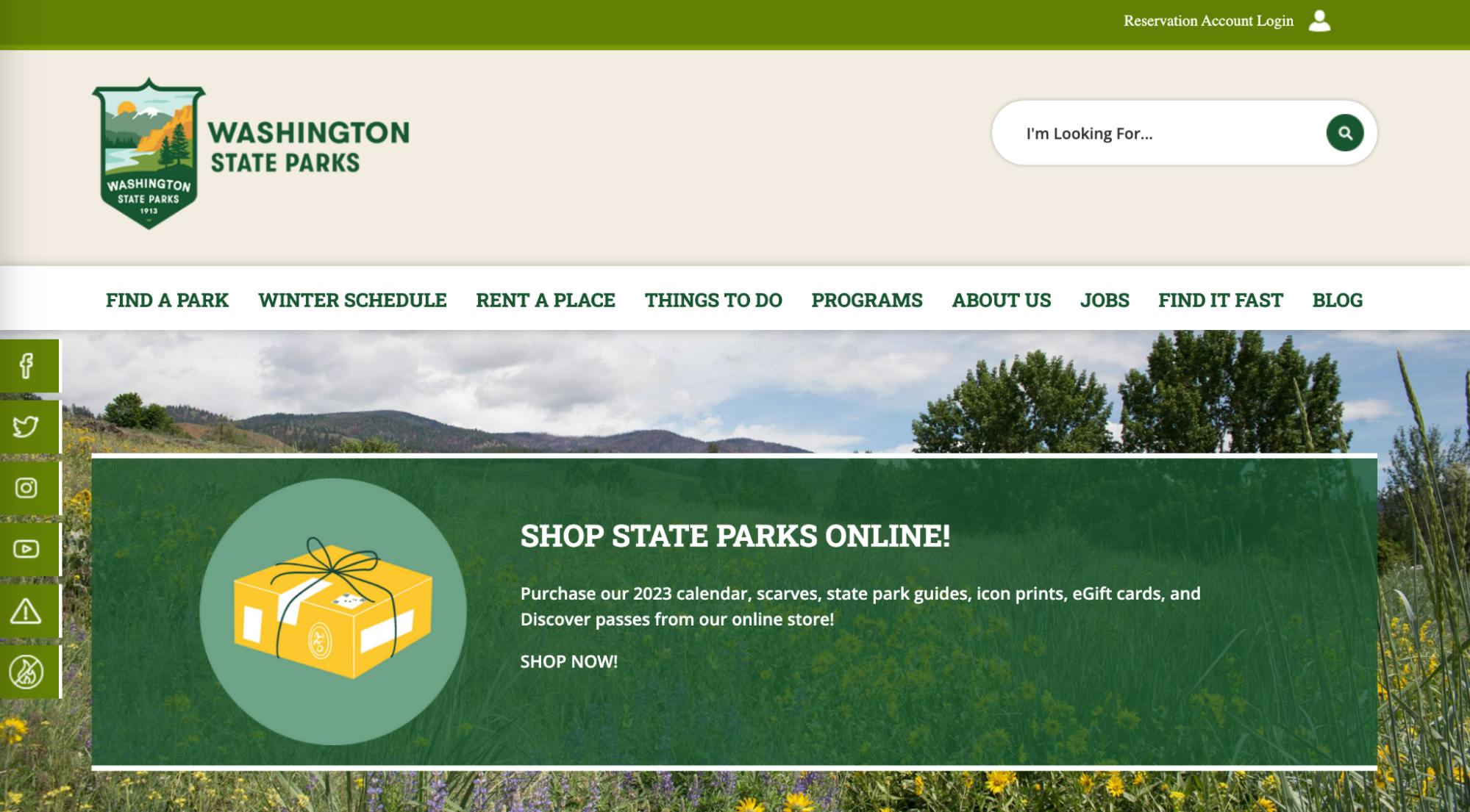
Washington State Parks website
We built a lot of lasting relationships with communities from around the state and ensured that our process reflected our values.
A big change was to your logo. Can you tell us how it was conceptualized?
We began our rebrand process from a place of curiosity and really took stock of where we were as a brand – do the stories we tell resonate with our communities? How do the visuals we use represent our values?
Brand is about emotion and perception – but how do you catalogue a feeling? How do you quantify a moment? We started with memories and asked people from all around the state to share their favorite state parks memories.
We found that our parks are personal, moving, and at times indescribable. We knew our new brand would need to allow for all of these feelings to coexist within its “universe.” It needed to be able to be filled with the unique emotion and circumstances of each person and each day, yet still fiercely, proudly and recognizably Washington.
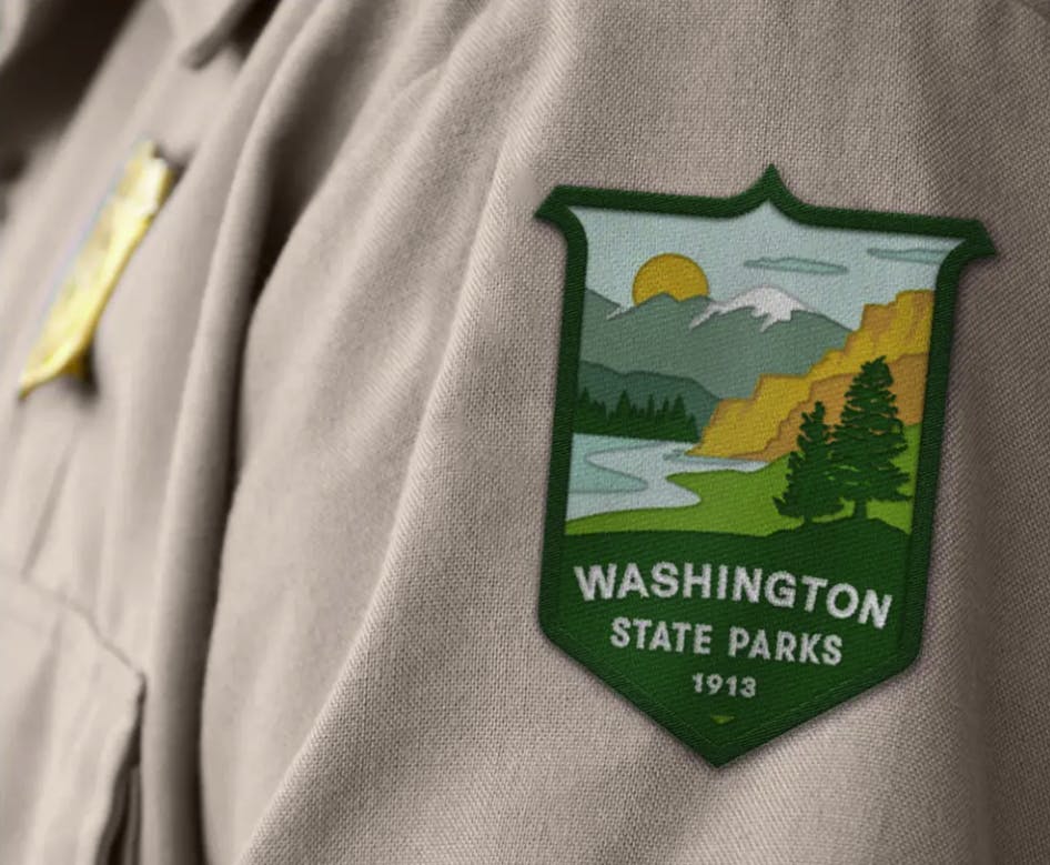
New Washington State Parks logo from People People
We also heard feedback around our current logo not representing the entirety of the state. Washington has one of the largest numbers of diverse ecosystems in the country. How do we capture diverse ecosystems while encapsulating a wide variety of emotion?
We decided to build upon our existing identity and incorporate landforms from around the state, broaden the color palette, unify the text, and soften the overall “badge” shape while maintaining its shell.
On the western side of the state things are very lush and green but toward the eastern side of the state we have some more arid landscapes – so we kept our trees and water to nod to the western side of the state, but also added in landforms that are representative of the eastern side of the state: columnar basalt, shrubsteppe and a mountain inspired by Mount Spokane.
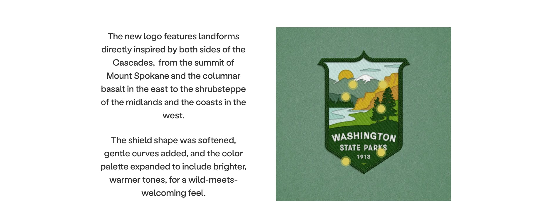
A closer look at the logo from People People
The colors speak to this as well – blues and greens are very western-representative so we added in some earthy gold and rust tones to strike that balance.
How about your color palette? How did you land on these colors, and what do they say about your brand?
We spent a LOT of time thinking about our colors and having conversations around finding a balance between a brighter, pop palette that may be more engaging right now and a more demure, muted palette that maybe isn’t as immediately engaging but will resonate for decades.
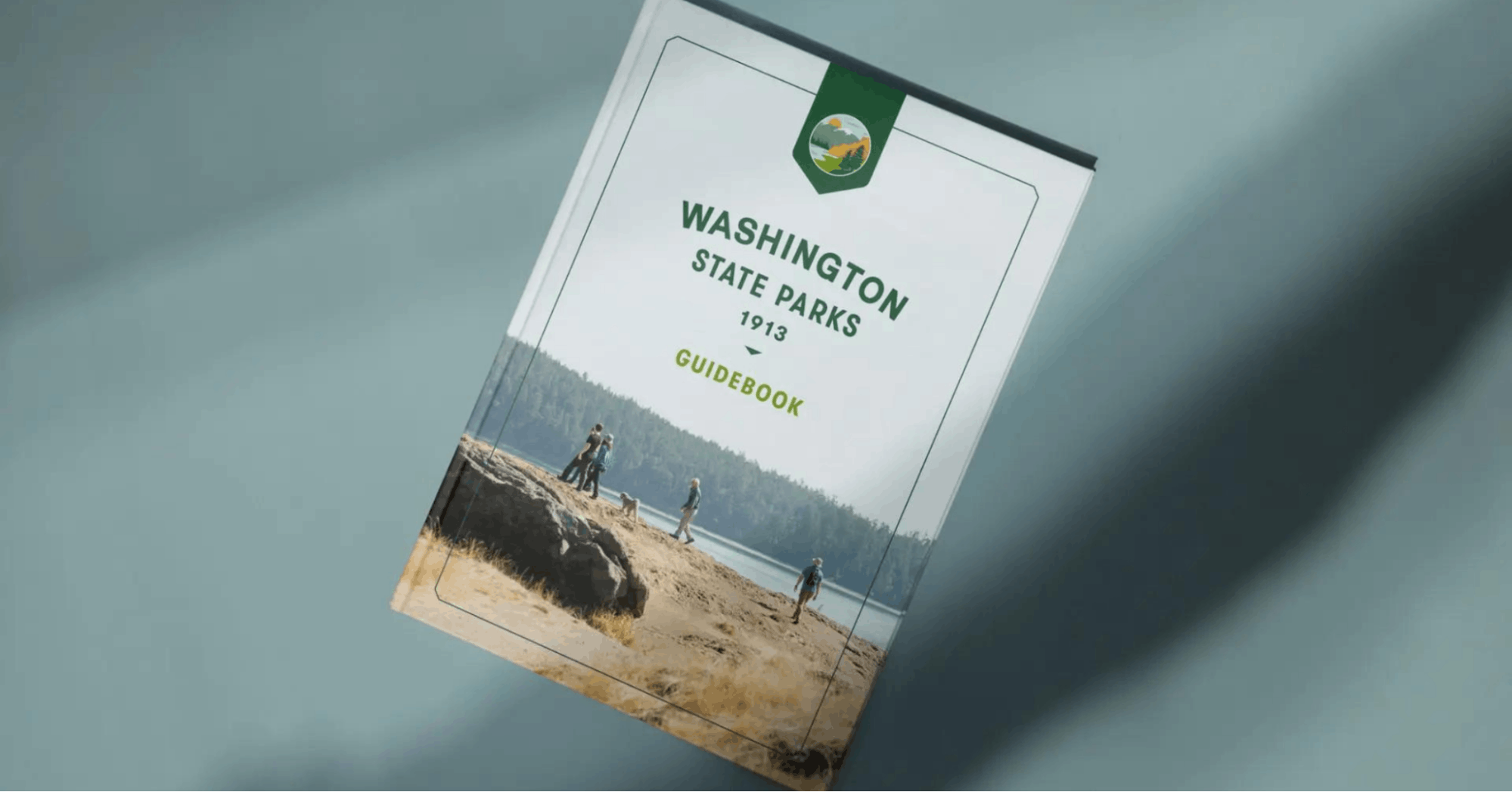
Washington State Parks guide book from People People
We ended up striking a really nice balance that brings in fresher colors to broadly represent the beauty found across the entire state but keeping them hued to stand the test of time. Earthy golden tones are anchored by deep greens, a crisp apple green and a splash of light blue.
Can you tell us more about the fonts that you use? How were they chosen? Were they custom-made?
We decided to continue using our current typeface, GT Walsheim.
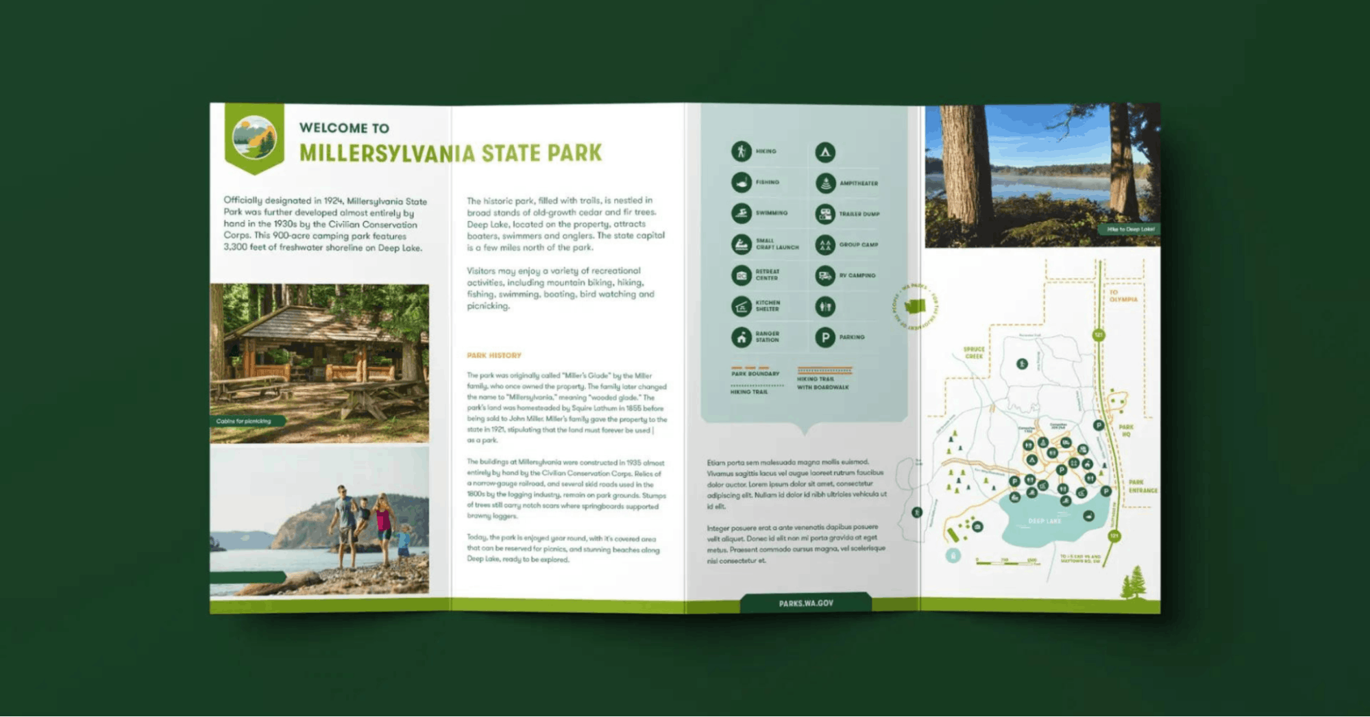
Washington State Parks pamphlet from People People
It was really important to us to build upon our existing equity, and carrying forward this typeface was part of that. GT Walsheim is a friendly and succinct typeface that was inspired by hand-painted lettering found on the 1930s travel posters.
This no-nonsense sans serif font has practical utility (and not a lot of fluff). It’s impactful and smooth, which allows it to act as a design element on its own.
Photography is also a big part of your visual identity. Can you tell us more about the photo direction?
We’re extremely lucky to have such stunning backdrops – everything from waterfalls to beaches to caves to mountains to canyons. Nature doesn’t need coaching or touching up. And while we capture the beauty of our parks, we’re also capturing the beauty of those recreating within.
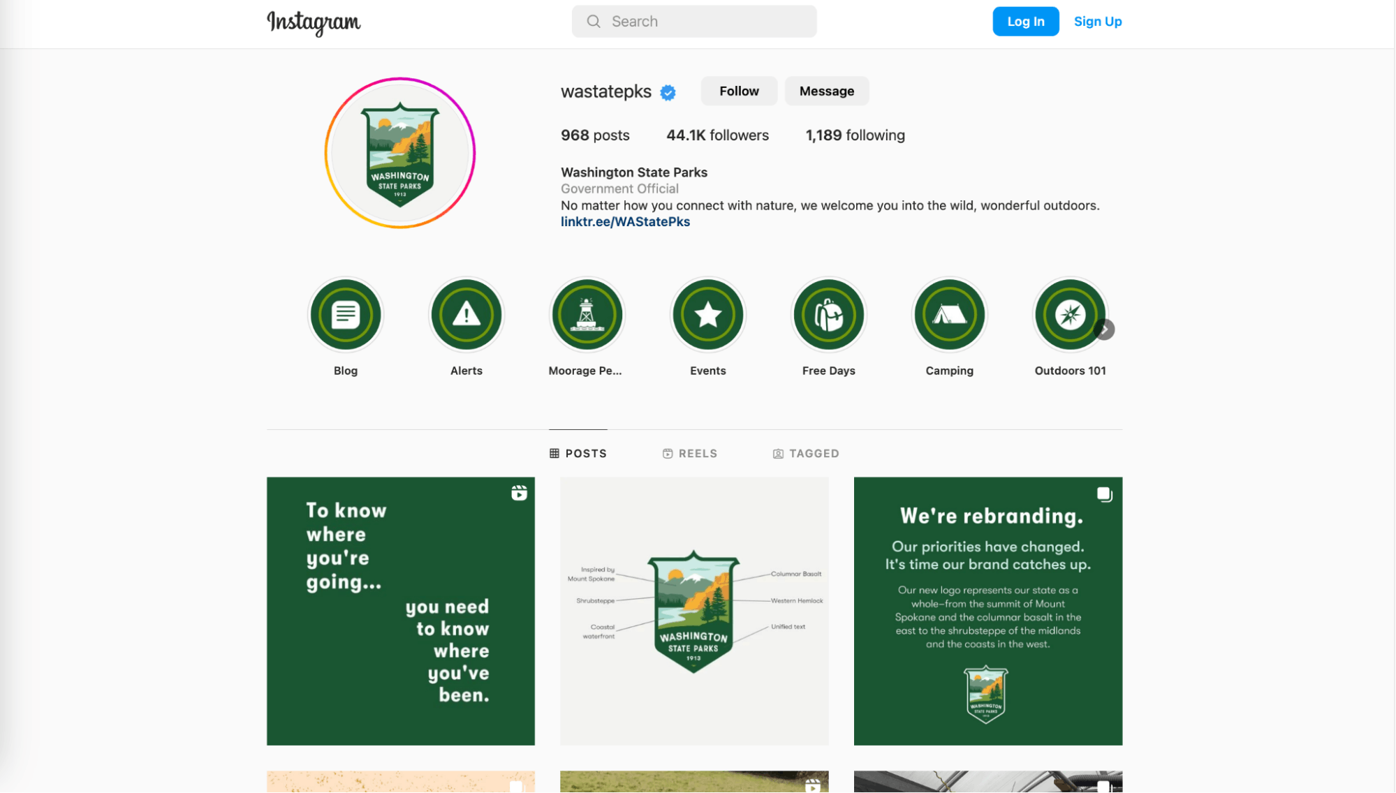
Washington State Parks on Instagram
We try to capture movement, emotion and authentic experiences while depicting people from all types of families and walks of life. We want you to see yourself in our spaces.
What is your major takeaway from this experience? Or, do you have any advice for brands or designers embarking on rebranding projects themselves?
Do the work. Before you pick up a stylus or crack open a swatch book, make sure you’re putting in the hours to understand where your brand is and where you want it to be.
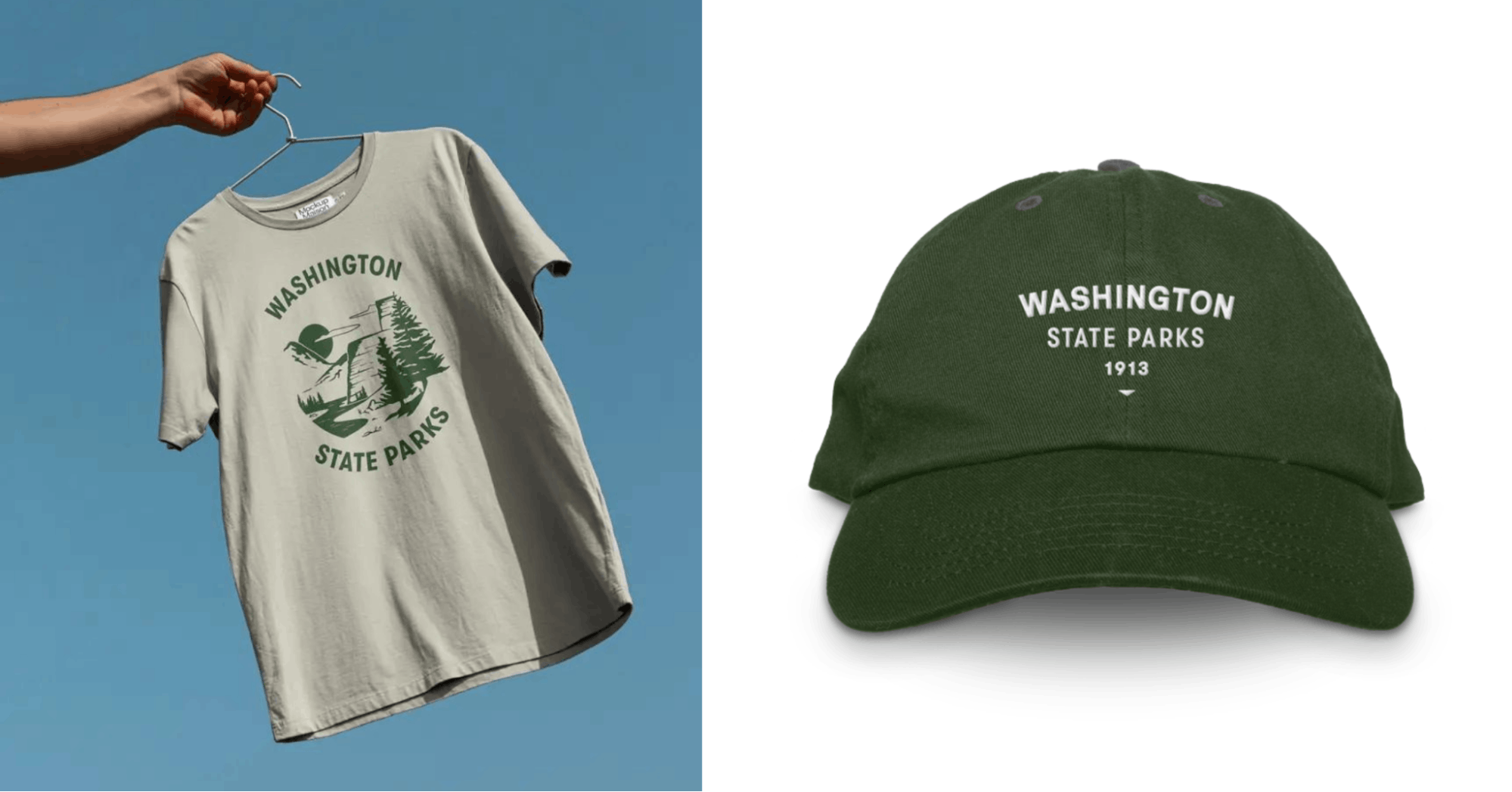
Washington State Parks merchandise
That involves a lot of listening, researching, and setting strategy and vision. After that, the design will fall into place.

